Mini book envelope template Paper cutter Stapler Scissors Glue stick Card stock Scrap chipboard Marker Pen Pencil Assorted text weight paper Craft knife Cutting mat Metal ruler Needle and thread Buttons Twine Needle tool or awl for poking holes for sewing (optional) Circular hole punch (optional)
Instructions
Download and print out the mini book envelope template. Roughly cut it out and glue it to card stock with a glue stick. Cut it out along the edges. Now it’s durable for repeated use.
Glue the printed out template onto scrap cardstock for durability, then trim.
Get an assortment of text weight paper, like typing or copy paper, and cut it into 4 inch by 2 inch pieces.
Fold three or four of these 4 x 2 inch pieces in half.
Cut some assorted card stock also into 4 x 2 inch pieces. Fold one in half for a cover for each book you want to make, over the folded text weight pieces.
Staple each book at the spine.
If needed to make the pages and cover even, trim the fore edge of each book with a utility knife and ruler, or a paper cutter.
Now you can doodle, color and collage on the tiny book pages whenever you have a little time. You can freehand draw or use a stencil to help you get started.
I made a stencil out of some scrap chipboard of some of my favorite doodle shapes to trace and help jump start some doodle pages.Doodling and collaging using my stencil shapes as a starting point.
To make an envelope for your book, trace the mini book envelope template onto the reverse side of some card stock.
Fold the envelope at the dotted line, then sew buttons on the flaps. If you want, you can cut some circles out of cardstock with a punch to set off the buttons. Tie a piece of twine to one of the buttons to make the envelope closure. You’re done!
Sew buttons to the top and bottom flaps so you can wind twine around them for a closure when the envelope is closed.Tie twine to one of the buttons to make a wind around closure.
Here is a link to a similar project I made several years ago, this time with mini accordion books:
Sometimes when I’m stuck for ideas I’ll make a themed collage out of rubber stamped images combined with other images on paper scraps. My approach is more like an all-over pattern in the manner of a fabric print or wrapping paper rather than a fine art collage with a focal point. This all-over pattern collage is easy and I can almost do it on autopilot. When the collage is finished I usually get inspired with ideas for how to use it. If not, I scan it, put it in a folder, and I know it will be there for later when I need it.
To begin select some stamps that fit a theme of your choice and stamp them in black ink on different colors of paper.
Stamp credits: Art strip CarolynHDesign, paintbrush by Stampa Rosa, Art from Dream Slab by Postmodern Design, paint tube by Tin Can Mail, Art Capital A by Hampton Art Stamps, Limbert’s Arts and Crafts stamp unknown.
Tear out the images you just stamped into small pieces, then do the same to some decorative paper and found images from your stash. To go with my art and art tools theme, I picked some black and white papers.
Black and white decorative papers by CanvasCorp.
I start gluing down paper pieces in the middle of a piece of backing paper, then work my way gradually out to the edge.
There are usually a few gaps left here and there after the paper is nearly full, so I cut or tear some pieces to size to fill in the last few spots.
I usually end up cutting the resulting collage into smaller pieces to use in paper crafting projects such as cards. But before I do that I scan the image so I have a digital file of it that I can use in graphic design projects.
Try inverting the colors in some graphic editing software such as Photoshop for unexpected color combinations.
After inverting, I slid the HSB (Hue Saturation Brightness) tool to get additional fresh color combinations. I stopped on this, my favorite, to export a sample I want to use right away. I think after this article goes live I will use it for awhile as a Facebook cover graphic.
Here are some crafted and digital projects I’ve made in the past that make use of themed collages using the same process.
Rubber stamped paper frame around a collage on an art journal page.I made the collage based on an activity prompt by Somerset Studio Magazine. The stencils for the collage are by The Crafter’s Worshop and Tim Holtz. The rubber stamps in black making up the frame are of my own design. The background paper is by p13.
I made this rubber stamped paper frame for an art journal page. You can make one like it for that purpose or other projects such as scrapbooks, greeting cards, photo displays and more.
When I placed my collage on this piece of decorative paper for my art journal, I thought it needed a little more so I decided to make a frame for it. I used tracing paper to draw out the size and shape I wanted. Then I transferred my drawing to scrap card stock and cut a template to use for tracing.
I traced around and cut out four frame pieces.
I wanted black and near-white rubber stamped images to glue to the frames, so I got a bunch of stamps out that are of my own design and stamped them in black stamping ink on cream color card stock. Some of these stamp designs are available in my Etsy shop, and some only exist as hand carved stamps.
Tearing the stamped cardstock into strips for making smaller mosaic pieces
I tore the stamped images into small pieces, and glued them to the frames.
After trimming the frames were done and ready to mount in my art journal.
I’m working on a lesson plan to possibly teach at Thomas Dunn Learning Center. I plan to make another, more polished sample. You might enjoy seeing the steps I took to make my prototype.
I took a piece of paper and drew lines in pencil to roughly divide it into 7 vertical sections – one for each letter in ROYGBIV, the way were taught to memorize the colors of the rainbow when I was young – Red, Orange, Yellow, Green, Blue, Indigo and Violet.
I made each divider line a double line, then hand drew some overlapping bird silhouettes in pencil. I treated the birds as negative space and the sections above and below as the positive space. I outlined and then filled in with black pen doodles the top and bottom sections above and below each bird. I erased the pencil lines.
ROYGBIV starts with Red, but I wanted Red to be toward the middle and not the end since the warm colors draw the eye more. I started outlining the negative space on the inside edge with red colored pencil starting with the fourth line from the left. I outlined each divider line in the successive rainbow colors in both directions and for about half the bird shape on outline on either side. I gave the outlining a soft graded treatment so that the white birds would have a “glow” to them and come forward visually when the background was filled in and darkened.
I colored in a mosaic of color patches in colored pencil roughly following the rainbow progression. For example where it’s supposed to be violet, I colored with violet and analagous colors such as purple and pink. The only thing I left white was the middle of the bird shapes.
Colored pencil leaves kind of a waxy surface that doesn’t take pen or marker ink well sometimes, so I sprayed the piece with Workable Fixatif to treat the surface to accept marker and pen.
Here is how it looked with the background textures partially filled in.
I wanted a darker background so the birds would stand out. Some of the doodles I drew lended themselves to filling in the negative space in solid black. Other patterns I had to get a little creative with to find a way to make them darker. I looked for ways to add solid black areas to those patterns.
Here it is all filled in. I’m going to make a neater sample on sturdier paper as a sample then schedule the class. This was a test to see if the concept would work, and I think it will! Do you have an suggestions? Please comment if so!
Here is Dad in Open Art Studio with me at Thomas Dunn Learning Center a couple of days ago. He’s coloring in a black and white doodle he did last year.
Yesterday my Dad and I went to Hawn State Park in southern Missouri to watch the eclipse. I took my drawing and doodling supplies with me to help pass the time while waiting for the main event. We left fairly early because we knew there would be a lot of traffic and we got there about two hours before the sun started to get covered up. The state park had a nice parking area for us in a mowed field. We had a little picnic and I sat on a blanket doing an eclispe inspired piece of doodle art with colored ink pens and markers.
I am very grateful that I was able to do this. I’ve been in physical therapy for the last several weeks for an arm and wrist injury. I’ve been severely limited in my usual activities for the last couple of months but I’m getting better. I’m slowly adding in my normal activities one by one as I do exercises to get stronger. I’ve added back in crafting, gardening, and now drawing. A week ago my wrist hurt so badly that I could barely address an envelope. This is my first drawing since the injury. I did it without pain and my injury doesn’t feel worse this morning. I’m on the mend and I’m very thankful. I think sewing is the last normal activity to re-try.
When I started this doodle, I knew I wanted to do something inspired by the color wheel. I decided to make each color inspired by a stage of the eclipse. I just doodled whatever came into my mind. As we got closer to totality, I started setting the stopwatch on my phone to go off every 10 minutes – then I’d look at the sun through the eclipse glasses and draw something inspired by that phase.
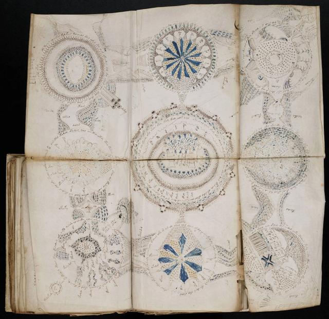
I kind of had a vague image in my mind of a weird foldout from the Voynich Manuscript as I doodled.
Without looking at a copy of any of the manuscript pages as I drew, I was just trying to get the feel of it, trying to imagine how someone trying to penetrate deep mysteries without the answers that we take for granted now might have reacted.
EDIT 5/15/24: I’m going to have to come back and revise this section. Now that my water garden has grown in a bit more this spring I can see that the cattails sprouted where the Water Willow was last yearand what I identified as Water Willow in this article is Cattails instead.
I was also inspired by some plants in our outdoor water garden. I have a small stream as part of our outdoor pond. It acts as part of our filtration system because I run water through lava rock and plants that are in it. One of the plants I grow is a Missouri native called American Water Willow. The stems have really interesting cross sections. I was also thinking about these stems as I was drawing.
Cross sections of American Water Willow stems in my water garden. I don’t know why it’s called water willow. The flowers seem orchid-like, and the leaves seem iris-like. Oh well, its beautiful and native so what’s not to like?
Sitting in the warm sun on a perfect day in a beautiful park with my Dad was a treat. And I proved I can draw again so I can resume my plein air drawing group activities and watercolor painting classes that I was taking before I got injured. That’s a big weight off my mind! I also have a class coming up that I’m teaching – my first since the COVID pandemic – and I’m relieved to know I’ll be able to do a good job.
I haven’t wanted to talk about the injury unless I absolutely have to because it’s scary and I was embarassed. For example I wasn’t able to brush my hair and it got so tangled I asked my husband to cut part of it off. I have about four hairs in each follicle for every one that most people have, so my hair dresser has told me. It doesn’t take much for it to turn into an inpenetrable mat. So I was looking like a Harpy Eagle or like I was trying to audition to be in Night Ranger until I got it fixed. I’m slowly getting my life back together and resuming normal activities. That is a relief because I’ve been very stressed out by not being able to do what I normally do. It’s easy to feel isolated if you have an injury. If you ask for help you don’t know if you are going to get helped or attacked because people think you should be getting well faster. It’s humbling and it really makes me have additional empathy for other people who are strugging with something similar, whether permanent or temporary. I’m more grateful than I can say that the therapy is working.
Pieces of paper that I stenciled on with paint that was about to dry up.
Have you ever mixed up several colors of paint and looked for a way to use up the leftovers before they dry out and go to waste?
I’m in that situation today, so I’m going to share with you a few pictures of one of my favorite ways to use up paint – stenciling!
Stencil designs by The Crafter’s Workshop. Clockwise, from upper left: Cosmic Music, Rainbow Montage, Dash V, Bubble Scribble.
I have a large collection of stencils, both commerical and original hand cut. The stencils in this article were designed by The Crafter’s Workshop and are for sale in my online store. I do a wide variety of art and crafts that involve paper and cardstock, such as greeting cards, collages, book arts, scrapbooks, tag art, mail art, planners, art journals, doodle art and more. Stenciling some cool designs on scraps is a great way to build up a collection of interesting papers for future projects. Paint that is on the verge of drying up is ideal for stenciling – the tackiness helps prevent running or bleeding.
I pulled out some papers to stencil on from the following sources: old planner divider pages, reclaimed shipping tags, product packaging, scrap cardstock, scrap chipboard and cardboard,interesting backgrounds accidentally made on waste paper that covered my work surface, assorted unfinished project pieces that could become art journal or doodle art pages.I use dry sponges and tools for each color. If any water gets in the paint, it usually causes running or bleeding of the design, so I avoid that by having enough dry tools ready when I start to work.After I’m done with each color and stencil, the tools go in a container of water until I’m ready for the final cleanup. I start the next color with a dry sponge and dry tools.Some of the paint was too far gone to stencil the normal way – full of lumps. Feeling playful, Idecided to see if I could mix in some water putty and make my own dimensional paste. I answered my question – yes I can! No it’s not smooth like commerical dimensional paste – but it was fun to see what happened and it’s a surface I can play with some more later. Tip – if you want to make your own chalk paint, you can mix in a little water putty or tile grout to acrylic paint.The stencil shown in the photo above is called Splash Whoosh.
I published a paper ‘zine called the Lime Green News from 1991 to 1998. There were 18 issues. I was burned out on it when I quit, and weirded out (ok, kind of scared) by some of the creepy attention I was getting. At the time I was glad to switch to web sites, e-newsletters and my blog for awhile as a writing outlet. I did a lot of business blogging for clients and employers as well. For about four and a half years I’ve been fantasizing about starting the Lime Green News up again. When it ended it was 24 pages which is a lot of content to get ready all at one time when I haven’t produced a printed ‘zine in so long. I decided to try to bridge the gap with a new mini ‘zine called, what else, Lime Green Mini ‘Zine. I was going for a loose, grungy look for a little 90s nostalgia and hopefully low-tech appeal. I’ll refine the design as I go but I’m pretty excited to get this far. It’s been a long time coming!
I’m going to produce roughly 50 copies of the first issue. While I brainstorm about how to distribute the new ‘zine, here is the Vol 1, No 1 content to explain what I’m doing. I’m also providing a couple of templates for the front and back covers in case you like the format and want to start your own ‘zine. Enjoy!
“Welcome to Volume 1, Number 1 of Lime Green Mini ‘Zine!
Back in the 90s, I used to publish a paper ‘zine called the Lime Green News. If you want to see what it looked like I have some back issues for sale in my Etsy shop (etsy.com/shop/CarolynHDesign, look in the Zines and Magazines section). For awhile I didn’t want these old issues to be seen, but they are so old now that it doesn’t matter if they are kind of embarrassing.
The Lime Green News, like my current blog (chasenfratz.com/wp), was about whatever creative projects I was working on or studying at the time. I also published artwork, poetry and articles by other writers and artists. After I learned how to make rudimentary web sites in 1997, my Lime Green News web site (limegreennews.com) gradually replaced my paper ‘zine.
After awhile, the format of the old Lime Green News web site got outdated and embarrassing, just like the paper ‘zine, but I left it online because it had a whole bunch of content on it. Now it’s old enough to be considered “vintage”. Vintage web sites that are still live can serve a valuable function in society. Much of the history and culture of the early Internet years is in danger of being lost. And the World Wide Web is increasingly hostile to any content that is independent and not corporate in origin. One nice thing about a web site made with primitive code is that it still works! While the rest of the web has to keep changing over code to adhere to newer and newer technology, my primitive web site will still run. So instead of being embarrassed that I don’t know the latest ways of coding any more, I’m going to keep doing the primitive code so that the work will hopefully have a long life.
The Lime Green Mini ‘Zine is a little project I’m doing because after years of being away from the ‘zine scene, I want to experiment with getting back into a paper publication I can touch. It’s going to supplement rather than replace my blog. I expect the content will vary according to whatever I’m working on or writing about at the time of publication.
I designed the front cover template to incorporate pockets that I’ll slip little items into. It might be a project or a sample. There are probably some people out there who crave something tangible and tactile to augment all the electronic content we consume. I hope you enjoy it!
You might be asking yourself as you look in the pockets of this issue, what’s up with the Christmas projects? I’m working on projects to submit to magazines, which need seasonal projects far in advance. I got behind on Christmas 2023 because of some personal grief and trouble, so as I get caught up I’m working on next year as well.
Have a great 2024!”
I printed out the first six issues actually on my desktop! Here they are with little projects in the pockets and QR codes to scan to find out how to make them.After a bit of refinement to my originals, I’m going to get the rest of the copies done at the office supply store to save on printer toner. I added a touch of design tape to fix a mistake I made when assembling the first copy, but I liked the effect so I’m going to keep using it for awhile.I own a long-arm stapler, but these ‘zines are so small I don’t even need it!
A celebration of my favorite color – green. Especially lime green!
For the last four years, my husband and I have been doing a conceptual art project called #12daysoftomsbeard. It’s a fun way of combining crafts, installation art, photography, mail art, digital art and conceptual art into a holiday celebration for us and our friends and family and anyone else who wants to join in. From December 25 through January 6th Tom poses for me with different items in his beard. I then apply wacky filter effects then upload the results to Instagram. We invite people to send in pieces to use in the beard. Sometimes Tom is more than just the muse and model and helps make some of the pieces and art direct it.
I make a lot of the pieces for the beard – until we get more participation, if we ever do, I’ll be making the majority of them. Not that I mind. Each year it’s been kind of an endurance contest to keep coming up with ideas for 12 days in a row, though well worth it. The activity is creatively fruitful and yields a lot of ideas I can explore throughout the year in other art and craft projects. This year was different though – at the end I was ready to keep going when it was over! So was Tom. He kept floating ideas to me, and me to him. At the time of this writing I’m still on a roll.
During the second year of the project I was really turned on by colors and made a lot of colorful paper pieces to put on Tom’s beard to accompany collaged paint sample cards that I salvaged and upcycled for my stash back when I worked at Central Hardware in 1989. I still have some left, and I still enjoy them! I decided to try a different color scheme for each day and see how many different ways I could interpret it. Did I develop all the ideas as far as they could go? Not even close, but it was and is a great exercise.
Colorful paper pieces made for #12daysoftomsbeard, inspired by upcycled paint sample cards.
Cookie cutters are convenient sources of shapes to trace, and might also be part of what makes this project “conceptual” – #12daysoftomsbeard could not happen in the format I’ve chosen without modern tools such as social media, smartphones, and digital filters. On the other hand, Christmas is nostalgic and comforting in times of uncertainty and technocratic threats, and what symbolizes holiday warmth and low-tech pleasures more than home-baked cookies made with vintage cookie cutters? I’ve decorated my paper “cookies” with craft bling instead of colored sugar, little silver candy balls, sprinkles, and whatever else is shiny and delicious.
Green beard pieces I made a couple of years ago on the left. One of them made a repeat appearance on Day 1, 2023-24.
There are lots of ways to bring in the “color of the day” to my beard photos, if that is the theme I’m on at the time. I use clothing, backgrounds, props and filter effects. I also purpose-make some colorful shapes from decorative paper and craft supplies. Because I have to work fast to complete one photo each day, most of them are really easy to make. In four years I’ve accumulated a lot of pieces. I can’t keep them all, so some of the pieces get sent on to other people, and others I’ve offered for sale as bookmarks in my Etsy shop. I’m going to keep some around, like these green ones, to re-use in temporary assemblages and actual decorations. (Decorations ARE temporary assemblages, aren’t they?)
Following is a simple plan based on circles for decorating paper ornaments cut from the traced outlines of nostalgic cookie cutter shapes.
Paper selection is important for this project because the design is so minimal. I’ve found that a monochromatic color scheme combined with metallic, glitter, and pearlescent surfaces is a pretty easy way to produce a finished result that looks sophisticated. See what paper and packaging is around that you can recycle. Greeting cards and gift packaging often are generously blinged out. Christmas card envelopes frequently are lined around the flap area with metallic paper that is perfect for this look. Then if you need to augment your finds, check out craft suppliers for coordinated special effect craft paper stacks. For this project you only need small paper pieces – take a look at small paper stacks in coordinating metallics, glitter paper, foil printed and more in your chosen colors to help you affordably build a stash of your own.
It’s a lot easier to make these than to explain why I did it, so let’s get to it!
Tools and Materials
Colorful and metallic papers – new or upcycled Cookie cutters Pen or pencil Scissors Scrap chipboard or card stock Glue stick Metallic paint pens Clean scrap paper Burnishing tool, such as a bone folder Decorative circle punch Glitter Clear drying glue suitable for adhering glitter Bright colored, pearlescent, glittery, or metallic stick-on crafting bling Hole punch
Instructions
Get out selections of cardstock in the color scheme of your choice. Punch out a bunch of paper circles with the circle punch and glue them down with a glue stick. Burnish well with a bone folder or other burnishing tool for a tight seal, with clean scrap paper in between to protect the paper from rubs and tearing.
Turn over the cardstock pieces and trace outlines from cookie cutters onto the back with a pen or pencil. Cut out the shapes.
Press on plastic jewels, or dimensional stickers onto some of the circles.
Here they are before I added edging.
Add some bling to the edges either by outlining in metallic paint marker, or squeezing out a glue line and sprinkling with glitter. I outlined half my pieces with paint marker, and half with glitter since I think the combination is pleasing.
To make my glitter more interesting, I mixed four colors together – yellow, green, metallic silver, and white opalescent. I had done some experiments with glitter on other pieces and I think a blend way more interesting than just a single color glitter – though the opalescent and variable kinds are pretty good on their own. Yes glitter is messy, and glitter glue pens are easier – I like those a lot too – but what fun it is to make your own blends!
This picture is for the next project, but it’s the same glitter blend I used in this one.
Let the pieces dry, punch a hole, and they are ready to display as you choose. My husband mocked me for writing this in yesterday’s article, but I’m going to say it anyway – since these are just paper, they are flammable. So don’t put them too close to candles or lights.
Some of my finished scribble art. This is the second of two scribbles. Are these finished “art”? Maybe they are, but even if they are not I might use the resulting textures as collage elements or image transfers in other projects in the future. They should look pretty good as is with a nice mat and frame.
The work on this page was inspired by the project “Collaborative scribble drawing” in the Expressive Arts Activity Book that I use a lot for study and inspiration (Darley and Heath 60).
Scribble art is a great icebreaker. No artistic talent or skill is needed so it’s easy to get started. If done as art therapy it can also create a rapport between the facilitator and the client by making it into a collaborative activity (Darley and Heath 60). For example, in a two person exercise each person can make a scribble on a blank piece of paper, then the participants trade papers and finish off each others drawings. The initial scribble can even be made with eyes closed to take all the pressure off of having to show artistic skill. Abstract results can also be a way to encourage conversation about something the scribble might remind the participants about (Darley and Heath 60). Following are several examples of scribble art that I made with my husband Tom and my Dad Don.
If you want to try something like these samples, here is a list for tools and materials.
Tools and Materials
Bristol board or drawing paper
Pencil
Eraser
Stencils
Black markers in various widths
Colored pencils
Found papers for collage – I used the insides of business envelopes
Tracing paper
Tape
Glue stick
Scribble art by me and Tom. I did moths on the left with Tom’s scribble and he used my scribble to add in various textures from stencils on the right.
Tom and I each made a scribble with our eyes closed with black marker on Bristol board. Next we traded papers and used commercial stencils by The Crafter’s Workshop to further develop the designs. Then we finished off our designs by coloring in parts of the image with colored pencils and markers.
Tom’s scribble was a challenge to work with because it was very dense. It did remind me of something – I turned it into moths trapped and tangled to represent trying to overcome some kind of frustration or challenge. This kind of work is not only good for the brain but just from a visual point of view it’s a good way to discover effects you might want to use in other art later on.
Scribble art by my Dad. Texture practice on the left, filling in the scribble on the right.
These examples were made by my Dad. First I gave him an introduction to Zentangle and doodle art which I wrote about in a previous blog post. He practiced making some repeating textures. Then we each made scribbles on two sheets of drawing paper. We kept our favorite of the two sheets then traded the other. Then we filled the sheets in with textures from our samplers. For extra fun we glued cutouts from the insides of business envelopes into some of the areas in the scribbles. I thought they looked cool with the hand-drawn textures. The tape and tracing paper from the materials list were used along with the pencil to get my collaged paper pieces to fit in their spots on the scribble drawing.
This is my first scribble art sheet in progress. I think it’s against the “rules” of Zentangle to pre-draw pencil lines as a guide before rendering the designs in marker. But I did it anyway!My finished scribble art after erasing the pencil lines. Bristol board and robust good quality drawing paper will stand up to a lot of erasing if you need it.I made a scribble version of Faux Postage using a printable template I shared awhile back. Dad had started this sheet awhile ago by making marks with stencils and markers in the upper left. He’d left the sheet unfinished for a year or two so I asked him if I could finish it. I was inspired by blue and black patterned envelope insides to make a monochromatic design on the sheet. When I finished marker drawing, coloring and collaging, I glued on some little pieces of paper printed with rubber stamps to evoke postage stamps. I’m going to get printouts made of this sheet and send it out to other artists when I next do some Mail Art.
I’m grateful to Dad and and Tom for doing art with me from time to time. I sure do feel a lot less lonely when I get to do a project with somebody. It helps us all with our general well-being and is also a great way to spend time together. When you’re working on art that is mostly mindless, once you get started, it’s easy to talk about various things. It’s also a good activity to do alone when you’re stressed and need to get in a better state of mind. The finished product really isn’t the point if you’re doing it for therapeutic reasons, but I also get skills and inspiration for future art work while I practice.
Works Cited andRecommended Reading
Darley, Suzanne and Wende Heath. “The Expressive Arts Activity Book: A Resource for Professionals”. Jessica Kingsley Publishers, 2008.
When I was in grade school in the 1970s, I developed an unquenchable doodling habit early on. I covered almost everything in sight with doodles, including my brown paper textbook covers, folders, notebooks and tops of desks – I used pencil on the Formica tops so it would wash off. I thought my habit was harmless and decidedly my own business because I only doodled on my own property or with media that was washable, and I refrained from doodling on homework. I remember that my third grade teacher didn’t agree with that point of view at first and would try to curb my habit by confiscating my implements whenever she saw me doodling away. I don’t think that lasted long. My Mom complained to her about it and gave me extra pens and pencils so I’d always have another one anyway. I was mostly an obedient child but this is one area where I flat out refused to conform. Before too long I was left alone as long as I washed my desk top periodically. That seemed fair to me and all was peaceful from then on.
A popular item I remember from the 1970s was a DoodleArt kit. These were basically sophisticated coloring posters for older kids, teenagers, and adults. The black and white design was Doodled for you and the consumer was meant to color them in with colored markers. As I recall these were sought after items by myself and my peers in the 70s. While shopping at the toy store and the craft store I would drool over them. If I got one for Christmas or a birthday it was a thrill. Here is a link to a vintage DoodleArt kit for sale on Etsy, and I also found an apparently attempted DoodleArt revival on Facebook.
In the present day, many adults once more enjoy adult coloring, similar to actual DoodleArt. Many people like related activities such as art journaling and bullet journaling. Popular Zentangle is a form of meditative pen and ink art where the artist fills in sections of a design with repeating patterns, usually in black pen or marker. Some people add color to their Zentangle designs. Zentangle results do remind me of DoodleArt in a way, though Zentangle practitioners freehand draw their own designs instead of purchasing pre-made coloring pages.
A lot of my art journal pages are somewhat similar to Zentangle, in that I often like to fill in sections with repeating patterns, sometimes hand-drawn, sometimes traced from a stencil. Whenever I put some of my new art journal pages on Pinterest, in the area where you are shown similar pins to your own, a lot of Zentangle art comes up in my feed. I decided just for fun to try Zentangle for real just to learn a variation on what I already like to do. It really scratches that doodling itch that I still have!
My sampler #1
There are lots of samples online of fill-in textures that you can draw in your Zentangle designs. I’ve linked to a few on a Pinterest board so you can see samples and get inspiration. After viewing some samples I decided to make a few of my own samplers featuring my own textures inspired by art journal pages I’ve already done. Here are some easy instructions for making your own sampler.
Tools and Materials Drawing paper Ruler Pencil Eraser Selection of fine tip black pens and markers of different diameters Optional – circle template
Use a ruler and pencil to divide drawing paper into evenly sized squares or rectangles.Outline areas in one thin line and one slightly thicker line. Fill in each section with a hand-drawn texture of your invention. Erase the pencil lines as you fill in the paper.As a variation, on a second piece of drawing paper I slanted the lines to make more irregularly shaped sections to fill in.Yet another variation made by tracing four different sized openings from a circle template.
Some samplers I’ve seen online are works of art in their own right. The ones you see here are not that refined – they are more for practice and developing a vocabulary of textures that reflect my own taste in design. When I’m ready I’ll have lots of choices I can use to make my own version of Zentangle art.