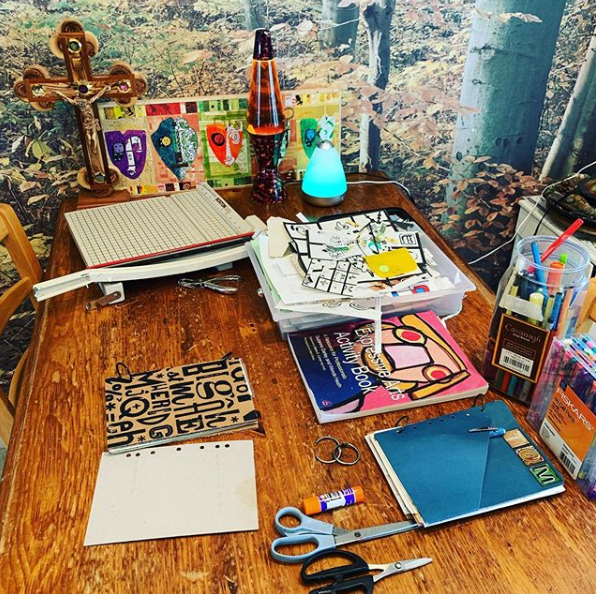
Directly above is a faux postage stamp sheet collage I started almost a year ago. Here is how it began. I was sorting through some old papers and I found two computer printouts that another artist, nonlocal variable, had sent to me as mail art a long time ago. The printouts were of faux postage designs featuring computer manipulated photos of Ray Johnson – an artist who is considered by many to have been the founder of the modern mail art movement. Ray Johnson is the subject of a lot of mail art projects. I participated in one such project myself in the fall of 2019. I also featured some pictures of Ray Johnson in my #12daysoftomsbeard art project because when my husband Tom is clean shaven, he looks so much like Ray Johnson that when I was working on the mail art project, Tom thought at first glance that I was using pictures of him!
In the same stack of old papers, I found an advertising booklet that had black and white portraits similar in size to the Ray Johnson portraits in the old printouts. At least they were close enough in size to possibly be used together in a faux postage design. I took a faux postage base I made a long time ago and use a lot and started laying down the portrait pictures on it to get ideas.
I originally had the idea to put the smaller portraits inside silhouettes of the Ray Johnson images and alternate the two on the stamp sheets. I made templates from scrap chipboard to help me cut multiple silhouettes and negatives of silhouettes from colorful paper scraps to play around with. I ended up saving the smaller black and white portraits for a future project and I kept the Ray Johnson images for this set of stamp sheets.
When I make chipboard templates for a collage or other project, I keep them in folders named after the project they were made for so if I want to I can use them over and over for related art projects. If I’m really turned on by the designs, I am likely to use the templates many times. I also made a bunch of rectangle templates to go with my faux postage stamp background, using tracing paper as an aid to finding which piece goes where on the collage. I numbered the chipboard pieces and their position on the tracing paper to help me get organized the next time I use the templates.
I arranged the different colored small rectangles on my collage sheets where I wanted them. I glued on the Ray Johnson images, some miscellaneous found images, and used black permanent Sharpie markers and stencils to draw on some bold designs in black marker. I printed out postage stamp related words, phrases and images with black permanent stamping ink onto white blank sticker paper, cut them out and stuck them on my collages to make them look even more like sheets of imaginary stamps.
I thought they needed more texture to look finished so I used freehand drawing plus stencils again to apply marks with paint markers and colored pencils. The final marks I applied were a bit of colored pencil outlining the white sticker pieces to make them look more integrated with the whole.
Here are the commercial stencils I used in the project. They were designed by the Crafter’s Workshop company:
I probably will display the resulting “stamp” sheets as framed collages some time in the future. I’ve scanned them into the computer where they will be reduced to a smaller size so that they look more like real postage stamps. Then I’ll print out and distribute the finished stamp sheets to some other mail artists. Many mail artists collect faux postage as art or use the resulting stamps as part of another piece of mail artwork.
(There was some kind of web hosting problem and this post got erased the day after I posted it so I’m recreating it here. Lesson, which I have learned to heed from past experience – always write your article in a text file on a hard drive first so you can quickly re-create it!)
There is a possibility that during my current Social Engineering class I might want to cite in a paper or project some of the old content that I produced for a Beatles fanzine in the late 1990s and early 2000s. I was a member of the St. Louis Beatles Fan Club and we published a fanzine called “What Goes On”. I’ve been meaning for a long time to re-publish some of these old articles on my blog, but to make them fully indexable I would need to find a way to access some of the floppy and zip discs I have to get typed-out copies of these articles. For now it’s a lot quicker to scan the pages I might want to use and put them in a PDF file. In order for the PDF to be somewhat searchable, I’m leaving the introductory text and index as text and not rasterizing it. I will also include a list of keywords for each excerpt so that researchers online can at least get a hint of where to access some of this information if they want it for study. I’m going to reproduce the searchable text in the PDF in the remainder of this blog post also. Believe it or not, there is scholarly interest in not only the Beatles, but also Beatles fandom, fandom in general, and ‘zine culture.
I kind of made up my own format, very loosely based on MLA, so I don’t claim that this document adheres to a standard way of cataloging this type of material. I might revise the format later. Enjoy!
Excerpts from “What Goes On”: A Beatles Fanzine Originally published by the St. Louis Beatles Fan Club, 1999-2003 Copyright 1999-2003 the original authors
Excerpts included:
Winkelmann, Carolyn Hasenfratz. “‘Across the Internet’ #1”. What Goes On, Vol. VI, No 3, October 1999, pp. 11-13. Keywords: fandom and VCRs, home video recordings, history of media formats, Across the Internet, internet use by fandom in 1999, early days of the World Wide Web.
— “Revolution #9: The Art of Play and the Joys of Noise.” What Goes On, vol. VII, no. 1, January 2000, pp. 6-9. Keywords: sound collages, music concrete, experimental music, sound experiments, conceptual art, performance art, home taping, cassette tape culture, Beatles 1968 Christmas message, Beatles fandom in the 1980s, history of media formats, noise tapes, White Album, playing records backwards, backwards sound experiments, St. Louis Steamers, Checkerdome, Revolution 9, soundtrack for art gallery, low-fi sound experiments, homemade sound recordings, prank calls, Commodore 64 computer, found sounds.
— “Across the Internet” #2. What Goes On, vol. VII, no. 1, January 2000, pp. 12-13. Keywords: history of media formats, Across the Internet, internet use by fandom in 2000, early days of the World Wide Web, RealPlayer, Windows Media Player.
— “Joe Davis Takes Us Back To ‘Meet The Beatles’.” What Goes On, vol. VII, no. 2, April 2000, pp. 1, 9. Aricle by Rich Reese, Carolyn’s contribution is the collages of Valentine cards on page 9. Keywords: Joe Davis, listening party, “Meet the Beatles…Again!” radio show, 97.7 KSD FM, Nick Baycott, Les Aaron, Bears Who Care, St. Louis Veteran’s Hospital, Brentwood Community Center, “The Beatles are more popular than Jesus” controversy, 101 the Fox, FM radio in St. Louis, Missouri.
— “Happiness is a Warm…Picnic.” What Goes On, vol. VII, no. 4, October 2000, pp. 4. Photos by Carolyn. Keywords: PepperLand, Creve Couer Lake park, Beatle Bob, Rich Reese.
— “I Wanna Be Santa Claus.” What Goes On, vol. VII, no. 4, October 2000, pp. 5, 11. Keywords: John Lennon tribute, Peace Tree, Christmas, Holiday party, Christmas ornaments, conceptual art, group art project, John Lennon, Yoko Ono, Bagism, performance art, peace activism, peace movement.
— “Pop! Goes The Beatles: the beatles and pop art.” What Goes On, vol. IX, no. 3, September 2001, pp. 13. Keywords: Pop Art, St. Louis Art Museum, Pop Impressions Europe, art show review, Richard Hamilton, mass media criticism, consumer culture criticism, printmaking, Peter Blake, swinging London, Eduardo Paolozzi, album cover design, Dieter Roth, illustration, fan art, interpretation of song lyrics.
— “‘Across The Internet’ #3” What Goes On, vol. IX, no. 3, September 2001, pp. 13. Keywords: Liverpool Sound Collage, Peter Blake, history of media formats, Across the Internet, internet use by fandom in 2001, early days of the World Wide Web.
Here are the Beatles Pop Art ornaments I made for a 9/11 benefit recovery raffle. I actually won back the Paul ornament and I still have it. Later I used the templates and prototypes to make a rubber stamping project that was published in RubberStampMadness magazine. Here is a link to an ornament that is similar to the ones in the article: Surreal Mixed Media Shadow Box Ornament
— “Fans and Friends Remember George.” What Goes On, Special Commemorative George Harrison Issue, February 2002, pp. 5. Carolyn’s contribution is the George Harrison themed Pop Art ornament. Keywords: Pop Art, handmade ornament, Christmas ornament, fan tributes to George Harrison, Dave Grohl, Louise Harrison, Jools Holland, Eric Idle, Anthony Kiedis, Mark Klose, Jeff Lynne, Gerry Marsden, George Martin, fan art, celebrity tributes to George Harrison, Louise Harrison Caldwell.
— “McCartney Drives Into Chicago With Full Tank: The Sights.” What Goes On, vol. IX, no. 1, June 2002, pp. 1, 6. Keywords: Paul McCartney concert review, Chicago, United Center, Driving USA Tour, concert lighting, concert video screens, special effects, performance art, live actors, Surrealist performance, Dadaist performance, rock concert production, arena rock, mulimedia, conceptual art, Pop art, Psychedelic art, art history.
— “‘Across The Internet’ #4.” What Goes On, vol. IX, no. 2, October 2002, pp. 5. Keywords: history of media formats, Across the Internet, internet use by fandom in 2002, early days of the World Wide Web, Linda McCartney photography exhibit, Sheldon Art Galleries, Nine/One One + One art show, Art St. Louis, 9/11 art show.
Note: For the 9/11 art show referenced just above, I made two collages to submit for judging. There are some differences between them that I deliberately put in to test a theory about which one had a chance of getting in the show and which did not. My prediction was accurate, and is interesting to think about in light of the social engineering I’m currently studying. Here are the links to the two collages, if you want to guess which one got in and what didn’t.
— “New Paul Live CD = Permanent Grin.” What Goes On, vol. IX, no. 3, 2003, pp. 4. Keywords: CD review, record review, Paul McCartney Back in the U.S., concert recording, concert CD, live album, live CD, rock concert.
— “Scrapbook Scraps.” What Goes On, vol. IX, no. 3, 2003, pp. 13. Keywords: scrapbooking, digital scrapbooking, Seattle, Seattle Kingdome, record breaking rock concernts, legendary concert venues, rock concert history, Hollywood, Capitol Records building, Hollywood and Vine, Yellow Submarine, John Lennon, Hollywood Walk of Fame, gold records, travel photos, Beatles impact on culture.
Here is one of our new Christmas traditions. For the second year in a row, here is #12daysoftomsbeard! Last year we distributed tags to family members on Christmas day to color on and decorate. We invited them to look for #12daysoftomsbeard on Instagram from December 25 to January 6. This year since we may not see family members in person on Christmas, I’m using the mail to try to get decorated tags to put on Tom’s beard. You are invited to decorate a tag from the image below and send it to us in the mail. Click the image to download a PDF to print out. Enjoy!
The “Back To Our Roots” art show opened Friday, February 21 and is on display until March 20. I am in this show along with 21 other artists who are students in nine different departments at Webster University. The exhibit is in the Contemporary Art Projects Gallery in Arcade building in downtown St. Louis.
From the upper right clockwise, my pieces are named “Correspondence That Could Have Been, I – IV”. Here is a statement from me about what these works are about.
“A dear friend of mine, Mark Reed, who I used to collaborate with creatively died in 2018. Over the years, we discussed, traded, and collaborated on art. Some of our collaborations became realized, some were unfinished, some were just talked about. We both used to enjoy the art format Faux Postage, also known as Artistamps or Artist Postage Stamps. This is an art form derived from Dadaism and Mail Art in which artists make up their own imaginary postage stamps to comment on the human condition through the concepts of correspondence and networking. It’s a playful format we both enjoyed in and out of active participation in the Mail Art community. For Back to Our Roots I’ve made four Faux Postage designs based on some unfinished stamp designs of Mark’s which used elements of some of my designs, for which he obtained my permission to use about 22 years ago. I have made one design with the price of postage at that time, one with today’s postage rate and a couple of values in-between. This is to symbolize that whether we were actively collaborating or not, during all the time I knew him his influence on my work was felt, and his influence will continue to be felt and warmly remembered by me as long as I am alive, in art and in life.”
The emotions and ideas in these pieces are intense and not entirely processed. The three art journals displayed below are works in progress that I use as creative expression and self-care to help me digest all kinds of things about life, both good and bad. Visitors to the show are welcome to page through them.
I have been working on a mini web site to go along with these journals to explain what is behind selected pages in these journals. It’s crudely formatted for mobile viewing so that visitors to the show can scan a QR code and read my commentary. It is readable on a desktop web browser too, though formatted in a bit of an eccentric manner there since I rushed it to get it ready for the show. Like the journals, it’s in progress and might be in progress for some time, who knows what the future will bring. I’m surprised at how much I have to say and how much is pouring out of me. To see what I have published so far, see the link below.
The gallery was broken into, vandalized and some of the artwork vandalized. The artists whose work was affected have been notified so they can make repairs. They expect to have the show up and running again by the end of the week.
A black and white collage faux postage stamp sheet I made. I used to get these printed on gummed paper and send them to other mail artists. Circa 1997.
I’ve been out of the Mail Art and ‘Zine scenes for over 20 years now, and to my surprise for some reason I’m getting nostalgic about it and thinking about getting back into it a little bit. I’ve never stopped making faux postage designs, rubber stamped art and Dada-influenced collages, but I stopped networking except through my web site because I got spooked by some of the extreme networkers I was occasionally in contact with. I figured I no longer had the stomach to participate in the “underground”. I mainly was networking for art and creativity and I’m still inspired creatively by what I did back then. I was not in it for anarchy, political change or social change except for some social commentary that I occasionally included.
I think part of the reason I feel like possibly participating again is that when I got spooked, I was in the middle of a couple of Mail Art group projects that I didn’t finish and I never sent out the documentation. I’ve felt guilty about this for a long time. One was called the “Turn Off Your Television Project” and another was called the “Fish Tapestry Project”. After writing the research paper I just published yesterday, I think I might want to finish that documentation and fulfill the obligation I took on myself 20 years ago. I probably won’t be able to get in touch with all the people who participated but I can try.
The Turn Off Your Television Project on display in my 1998 art show “Areas Affected by Shapes”.
A graphic I made to promote the “Turn Off Your Television Project”, circa 1998.
My friend Mark Reed who co-hosted the fish tapestry project with me passed away late last October and it would be a great tribute to him if I could finish that one too someday. I have only this week been able to bring myself to look again at some of his artwork that his family gave to me. I always thought he threw away too much of his old work and I’m glad that I have some of it. I may even finish some of the stuff that is unfinished. We collaborated and shared ideas a lot back in the day. I think he would like that.
Oh how I used to love making animated gif art!
I would be pleased if someone finished my old work after I’m gone. I’d rather have that happen than it be thrown away. I always have a lot of unfinished projects that I take up and put down at various times. I’m sure I’ll be leaving some unfinished ones behind someday. Actually it’s been painful for me to look at a lot of my old work and archives for a long time because so many of the people that I lived that time of my life with are dead. Maybe now I’m finally able to start dealing with the memories. Also I felt like much of my old work was an embarrassing failure. Looking at it now, some of is indeed embarrassing but some of it is not so bad! A former abusive relationship made me feel like I should not do any art because I was no good and didn’t deserve to do it just because it was good for me and made me feel alive. There was a time when I wasn’t sure I was ever going to take it up again.
Here is a faux postage design I made as a computer graphic when I was a beginner at learning Photoshop. 1997.
My Mail Art name was Carolyn Substitute, my ‘zine was called the Lime Green News, and my faux postage was produced under the name “Lime Green Post”. I decided today to do an online search and see if I could find any references to my old Mail Art activities.
If you would like to explore this world I found the following:
stardust Memories Mail-aRt-Links and projects – bless this person for putting a link to my old web site on archive.org! I haven’t seen it in so long. I redesigned it in 1999 and I don’t think I looked at the old one since then because it made me so embarrassed!
Lime Green Evolution World of Art – 1997-1999 – My first web site, how I transitioned from analog networking to digital networking. Thinking back on it, printmaking class in 1987 led to rubber stamping, rubber stamping led to Mail Art, Mail Art led to ‘zines, ‘zines led to taking a class to get better at desktop publishing, which led to published a web site, that led to being a web designer, which led to doing marketing which led to me working on a marketing degree. No wonder I called my first web site Lime Green Evolution. And I didn’t even put in all the other tangents I followed along the way! I used to stay late a lot after my web design job ended at 5 pm to work on my personal web site and wait for the traffic to die down.
One of the things we are studying in my Mass Communications class is how people make media meaningful for themselves. Back in the ‘zine / grunge / Mail Art era we used to do a lot of collages, small press publications and mixed media projects. I’m sure there are still people out there doing these things and with technology we have a lot more options available. Most likely I’ll be exploring this in a future research project.
Edit: here is my new page on the International Union of Mail-Artists web site. I’ll be putting some old and new work there.
I made this collage right at the time I stopped publishing the Lime Green News in paper form. I’m pretty sure I have a draft written on some floppy disc somewhere about how I made this collage and some others using outlines of black paper that I cut out with paper edging scissors to make compositions that look like postage stamps. I was going to publish the tutorial and a copy of the background for people to make their own stamps. I made several stamp sheets using this background as I recall. Such stamps are also known in the art and stamp collecting world as “Cinderella Stamps”, “Postoids” and “Artistamps”.
I never went back to the idea with this pseudo-postal background because I assumed that with computers and desktop publishing becoming more prominent people would not be interested in making faux postage stamps the “analog” way any more. But looking at this collage now that more than 20 years have passed since I made it I actually like it a lot. After going to that Gauguin show that I wrote about in my last blog post I’m reminded of how much I loved studying other cultures and abstracting some elements from them into and combining them with Mid-Century Modern type of abstraction. A lot of the black line work was made by rubber stamps. The Egyptian hieroglyphics stamp is a commercial rubber art stamp, but I carved all the others.
The above collage rearranged and with the colors inverted to use as a Facebook header
For some reason if I scan a collage and invert the colors in Photoshop, the results are often better than the original. I needed a new Facebook header so I rearranged the above collage and did a quick inversion. Fun!
Here is another collage I made using the same background
After Gauguin we looked at some of the other galleries. Tom is in red, Mike is in Yellow.
Yesterday my husband Tom and I attended the last day of the Gauguin exhibit at the St. Louis Art Museum, Paul Gauguin: The Art of Invention. Our friend Mike went with us and treated us to the tickets that he had earned from doing volunteer work.
When I first became interested in studying art, I wanted to be a painter. When I took ceramics and printmaking for the first time, I lost interest in painting and stopped reading about it as much as I used to in favor of my new passions. Over the years I also have done some pretty intense study of fiber arts, various crafts, collage, Dadaism, neo-Dadaism and Mail Art, ‘Zines, book arts, Outsider Art, Pop Art, photography, computer animation, web design, architecture, graphic design, the decorative arts, archaeology and anything Mid-Century Modern. Impressionism and Post-Impressionism were the first kinds of painting that drew me in but over the years I came to prefer Surrealism and Abstract Expressionism as painting styles. I hadn’t done any reading on Gauguin for a long time.
Some of Gauguin’s wood cut prints and a handmade book.
I really enjoy artists and designers who work in a variety of media, such as Alexander Calder, Henri Matisse and Frank Lloyd Wright. A lot of times I feel guilty about having so many interests and dabbling in so many different occupations and areas of study. Today’s society seems mostly to expect you to do only one thing but that is not and never will be “me”. So at this Gauguin show I was very intrigued to see some of Gauguin’s ceramics, wood carvings and woodcut prints alongside the paintings. There were ceramics and decorative objects from Gauguin’s personal collection as well as Oceanic and Peruvian art that was representative of the cultures Gauguin was influenced by. He was also at various times a sailor, a stockbroker and a writer. People like this make me not feel so weird!
The bright green and bright red ceramics and the one that kind of looks like a gourd are from Gauguin’s collection. The other more figurative ceramics were made by him. Some of these ceramics were inspired by paintings he owned by other artists, and the green jug was in one of his paintings. It’s always interesting to see artists’ personal collections!
As a former ‘zine publisher (Lime Green News 1991-1998), I was excited to see a woodblock print graphic in the exhibit that Gauguin carved to help him publish his own newspaper, which could be considered a type of ‘zine. I’m currently taking a Mass Communications class and in our textbook Mass Communication Theory: Foundations, Ferment, and Future by Stanley J. Baran and Dennis K. Davis, I’ve highlighted a very intriguing sentence: “Extremists were often forced to rely on older media like pamphlets, handbills and political rallies.” I don’t know if Gauguin would have been considered an “extremist” in his time but he was critical of religion and government and his lifestyle was, to put it politely, pretty “bohemian”. When I read the above sentence in my textbook I thought of the history of self publishing and the many forms it can take. Before movable type printing presses, documents were hand written or perhaps laboriously printed with hand-printing methods such as stamping and wood block printing. Later there were typewriters, carbon paper, mimeographs, copy machines, desktop computers with printers and the World Wide Web, making self-publishing easier and more accessible.
When I was ‘zine publishing, I used to make my originals on paper to be copied on a copy machine at the office supply superstore. I started out with text printed out on an inkjet printer on my 1983 Commodore 64 computer, which I used for all my word processing until 1995. I essentially made big collages for my pages, combining the printed text with a variety of graphics, collages and hand-drawings. If I wanted to add color I would sometimes carve a rubber stamp and stamp it on the finished prints. I think the largest edition I ever made of my ‘zine was 100, so stamping 100 times to add a bit of color was feasible.
I got a Windows computer in 1995 with a black and white laser printer. At that time I got Internet access for the first time and started reading on the World Wide Web. My first web site went live in 1997. Gradually I made my ‘zine using more modern desktop publishing methods and by learning software such as the Microsoft Office suite, Corel Draw and Photoshop. The last years of my ‘zine incorporated more and more “modern” techniques but were still made as big collages with some hand-embellishments before copying. In 1998 I just switched my ‘zine content over to my web site, which although a bit out of date in spots is still live (www.limegreennews.com). It needs some (ok a lot of) work because I’ve been neglecting it in favor of the blog you are reading now.
Publishing online is very satisfying, but I miss the lower-tech, handcrafted methods of self-publishing sometimes. I still like book arts in various forms. I’d like to write about or engage in some self-publishing as I work on my master’s degree if possible. It’s been on my mind ever since reading that sentence in the textbook. I got out some of my old ‘zine originals to go down memory lane and think about some possible research ideas. ‘Zine publishers do a lot of trading and I had a big collection of other people’s ‘zines plus material they sent me for consideration for publication. I donated the bulk of my collection to the Poetry and Rare Books collection at the University of New York at Buffalo some years ago but I did save a few things I especially liked. I have no idea what they kept of my collection if anything, but they did have a subscription to my ‘zine when it was in publication and I didn’t know of anyone else who might be interested! I didn’t save much of the “extremist” stuff for my own collection because it frankly scared me and was one of the reasons I dropped out of the printed ‘zine scene – it helped contribute to a major anxiety attack that I eventually received treatment for and recovered from. I don’t think I’ve ever said publicly why I dropped out of the ‘zine and Mail Art scene suddenly but that is a major part of why I did that. I do miss aspects of it though. I’m kind of hoping that working on my degree will bring opportunities to do some research on this era of communication or even get back into it in some way. I might even re-publish on this blog some things that are not too embarrassing that aren’t yet online. We’ll see!
Just for fun, since the art show I just saw included Oceanic art and some work by Gauguin that shows how he was influenced by that art , here is what the cover of Lime Green News #2 looked like. I took a postcard with rubber stamped art work that I liked from another mail artist and taped down some sketches from my then-current Oceanic art history class. I drew and stamped crudely around the sketches and the postcard to make a cover. On the left is my original, on the right is a simulation of what the cover would have looked like after copying it on a black and white machine at the office supply superstore. I don’t know if I even have a printed version of this issue in my archives, I probably just have the original. At that time, if my memory is correct, I used to print about 10-15 copies just to trade with people.
What do Ross Perot and Oceanic art have to do with each other? I had no idea then and don’t now, but one thing I have not ever grown out of is making collages out of random things. Now I call it Art Journaling and use it as one of my artistic outlets since I don’t really try to make “Fine Art” type art any more. It’s not that I don’t have plenty of ideas, I do, I just don’t see what good it would do for anybody. But I never know what older ideas I’m going to go back to!
Here is a bit of fun – a collage with elements that I have loved to use in art since I was a teenager – microscopic animals, amoeba shapes, cells and the color lime green (my favorite)!
I was looking through some old photos recently and found some pictures of old artwork. Some of it I had decided a long time ago was not very good. While taking a fresh look, I decided some of it was not so bad and maybe even had some ideas worth revisiting so I made an album for old artwork on Pinterest. Here are a couple of samples!