A SWOT Analysis is a Strength, Weakness, Opportunity, and Threat Analysis. Here I am using an outline partly based on an unpublished paper I wrote for Marketing 5000 class last spring to create a SWOT analysis for the #12daysoftomsbeard project. My unpublished paper, titled “(Name of Fantasy Company) Marketing Plan” was based on an assignment and outline given to us by Webster University professor Dr. John Jinkner.
I’m going to publish a small portion at a time, because it will take some time to write. I hope you enjoy it!

I. Executive Summary
#12daysoftomsbeard is a conceptual art project engaged in by Carolyn (Me) and Tom Winkelmann as part of our annual Christmas tradition. This is a young tradition for us, having been recently practiced for only the second year in a row.
The activity was inspired by several things. I have a long history of engaging in conceptual art through Mail Art, the ‘zine scene, and various art experiments involving photography, handmade books, ephemeral art installations, Pop Art, Dadaism, and more. There are two definitions of conceptual art in an interesting article I found, “If You Don’t Understand Conceptual Art, It’s Not Your Fault”. One definition, the one I gave to my husband off the top of my head while I explained why I wanted to take pictures of him with things in his beard, is that conceptual art is a form of art where the idea is the art and the tangible object created is not considered important. The other definition in the article is that conceptual art is a set of plans or strategies (Kaplan).
Tom has been letting his beard grow more often and is frequently teased about his beard by his family. Last year I decided it would be fun to turn the teasing into humor and art so I showed up at Christmas Day celebrations with colorful paper circles and squares with a few collage elements on them and writing implements for family members to color and draw on to put in Tom’s beard to take pictures of. The idea for hanging paper or art items from a beard is not original with me, there are people who use their beards as mini art galleries and vehicles for Christmas decorations.

I invited family members, many who I know like to paint and color, to use pens and markers to add to the paper pieces, which I then clipped to Tom’s beard with mini clothespins. Then I took photos for Instagram and posted one each day for 12 days, with the hashtag #12daysoftomsbeard.

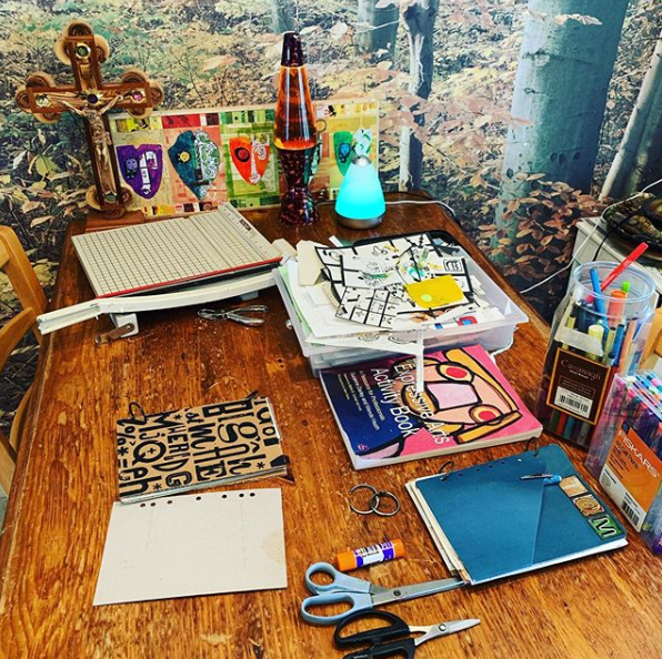
Since I like to art journal as a creative development and self-care activity, when I was done taking pictures of the paper pieces in Tom’s beard the first year we did the project, the 2019-20 season, I mounted them on art journal pages, some of which I planned to exhibit in the then upcoming art show, Back To Our Roots which opened in February 2020 at the historic Arcade building in downtown St. Louis.

II. Environmental Analysis
There were several parts to the #12daysoftomsbeard project as executed in the 2020-21 holiday season. Since I was anticipating only distance Christmas activities due to the pandemic, I decided to send out tags and invite people to alter them and send them back to take picture of in Tom’s beard.

1. I made a black and white version of collages that Tom and I made together to use in our Christmas cards, then had copies printed out on white cardstock. I traced shapes from Christmas cookie cutters onto the back of the cardstock and cut out shaped tags. I made stickers for the backs of the tags that explained the project and featured a QR code so that people could easily check the results of the #12daysoftomsbeard Instagram feed with smartphones if they wanted to.
2. I put tags in most of the Christmas cards we sent out. I also included in many of cards some scrap paper pieces and examples of faux postage that Tom and I made to use in Christmas artwork, for people who might want to join in but don’t have a ready supply of art materials around. Some of the paper scraps were examples of Christmas faux postage that I’ve made on my own and with my husband so if people didn’t end up using them in the project they might want them for some other craft or just something to look at as part of a Christmas greeting. For a few of the people that we hand-delivered cards and gifts to, we punched a hole at the top of a tag, attached a loop of cord for hanging, and put one on their doorknob.

3. I made a graphic to use as a social media header that included the QR code and images from last year’s beard series to raise anticipation and awareness. I also wanted to cheer people up with some bright colors since I knew a lot of people who were feeling sadness over separation from loved ones and the loss of loved ones during the holidays. I know from personal experience that the holidays and winter are often difficult for many people even in more typical years depending on their current situation in life.
4. To help people get started sooner if they were eager, since we weren’t as early as I would have liked getting our cards mailed, I made graphic that people could download and print out that had tag templates on it, instructions and the QR code.

I posted the template graphic in social media for download, and mailed and emailed a few copies to people I thought might be particularly interested.

5. In keeping with the theme of bright rainbow colors I had started, I prepared 12 little collages made from colorful upcycled hardware store paint sample cards so that I would have something to put in Tom’s beard if no one sent me any art pieces to use. On some days I made extra items to fit the color theme of the day and also incorporated found objects if I was inspired. For example, those two guys in the right picture above were cut out from a piece of junk mail. Some of the paper pieces there were parts from older Christmas card designs.

6. When taking the pictures, I had a lot of fun experimenting with different eyeglasses on Tom and taping things to the lenses of my clear protective goggles to make crazy compositions. I installed some new photo filters on my smartphone to make the pictures even more fun and colorful before I posted them to Instagram.

7. Tom and I were feeling lonely over the holidays and thought that since we were staying home, it might be fun to have a New Year’s Eve themed #virtualartparty, an ongoing series of online meetings I started when the pandemic began, with the purpose of cheering people up who were missing out on their usual social activities.

We ended up cancelling the New Year’s Eve edition of #virtualartpary because our cat Griffin was terribly ill that day and we were sure we were going to lose her. Griffin has been with my husband for 21 years and Tom needed my support and attention so he could be with Griffin, and I thought we were going to be dealing with grief on New Year’s Eve and not in the mood for a party. But to our grateful surprise, Griffin recovered and is doing very well now. At her age we know she won’t be around that much longer, but we aren’t eager to lose her any earlier than we have to.
Edit: Griffin passed away in February 2021 and our other cat Leo passed in the summer of 2022. We didn’t get another cat but we did adopt a leopard gecko named GG in 2022.
I had been planning to talk about #12daysoftomsbeard on December 31 as part of the #virtualartparty, the timing made sense since I was taking a daily photo from December 25 through January 6. I made some sequential social media header graphics with colorful beard pictures and the hash tag #virtualartparty to help build interest. I didn’t have time to make a header graphic for each of the 12 days, but maybe next year I should.
A. The Marketing Environment
Even though #12daysoftomsbeard is not a commercial activity, we do need to market the project in order to persuade people to participate.
1. Competitive forces. Other sources of entertainment, amusement or hobby activities are the main competition for the attention and time that potential participants might allow for just understanding what our #12daysoftomsbeard project is, much less time to participate. With the amount of time that people spend in front of a screen or with a smart device in their hand, it is difficult to get anyone’s attention away from anything that isn’t corporate in origin. It concerns me that synthesized culture designed to social engineer us is replacing genuine culture and whenever I can I’m trying to re-inject actual culture back into our lives. As Dr. Jim Taylor lamented in an article for Psychology Today, the nations of the former Soviet Union, Italy, Spain, Germany, nations conquered by the NAZIs, Cuba and North Korea have experienced decades of suffering because aspects of their authentic culture were abusively removed and replaced with a synthesized totalitarian culture (Taylor, “Popular Culture: We…”). I would add China and the United States to that list also. Dr. Taylor’s article reminds us why there are so many organizations throughout the world dedicated to cultural heritage and cultural preservation – it plays a much bigger role in our well being than many realize. I quote Dr. Taylor in this excerpt:
“As individuals, a genuine popular culture instills a sense of ownership and empowerment in our society because each of us knows that we contribute to that culture. We are more likely to act in our society’s best interests because we know that those best interests are also our own. An authentic popular culture also gives us a sense of shared identity, meaning, and purpose that transcends differences in geography, race, ethnicity, religion, or politics. All of these then encourage us to lead a life in accordance with our culture’s values and norms because they are our own (Taylor, ‘Popular Culture: We…’)”
In other words, if we throw away our authentic culture for synthesized corporate culture we should not have to wonder why so many of our citizens have been programmed to serve the interests of large corporations so thoroughly that they are literally waging war on their behalf with people that they formerly were able to co-exist with. Many people trust screens far more than they trust friends, neighbors and even family members that they have known for decades. The manner in which many people experience the world is corporate-based with life beyond a screen regarded as if it is fiction. They allow corporations to tell them what the world outside is like instead of going out and finding out for themselves. People are told that their own judgement is not to be trusted and they need corporate “fact-checkers” to tell them what is ok to read or hear about. I overheard art teachers as far back as the 1980s trying to urge some of my fellow art students to use their own authentic experiences and senses of self to create art instead of just drawing corporate cartoon characters and corporate based entertainment characters and content. I know so many people, who if you removed corporate consumer culture from the topics they could talk or think about, there would be almost nothing there. Teaching art or trying to market an art activity without corporate branding attached to it is inherently very difficult. We know that children can’t distinguish advertising from entertainment, that is widely acknowledged, but I don’t know many people who admit that a lot of adults can’t either. Most people I know aren’t aware that when they are entertained they are actually being marketed to and they are not the end customer for the entertainment – the advertisers are the actual customer.
The #12daysoftomsbeard project is not completely devoid of corporate content because it includes found objects and some clothing with logos. However, by basing it on the universal human experience of personal grooming and running it from December 25 to the Feast of the Epiphany (the day we Catholics observe it, my understanding is it varies depending on tradition), I intended to bring attention to authentic human and authentic Christian culture and away from the corporate way of celebrating Christmas for just a little while, just to give Tom and I and others a break and a reason to look at each other while really seeing and interacting each other. What would my slightly weird Christmas cards look like next to other cards designed by corporations? What do people think when they see the resulting pictures? What did they think about while making an art piece to send back?
Works Cited
Kaplan, Isaac. “f You Don’t Understand Conceptual Art, It’s Not Your Fault.” Artsy, 2016, www.artsy.net/article/artsy-editorial-if-you-don-t-understand-conceptual-art-it-s-not-your-fault. Accessed 22 January 2021.
Mitchell, Grant. “Strength, Weakness, Opportunity, and Threat (SWOT) Analysis.” Dotdash, 2020, https://www.investopedia.com/terms/s/swot.asp. Accessed 15 January 2020.
Taylor, Dr. Jim. “Popular Culture: Too Much Time On Our Hands.” Psychology Today, 2009, www.psychologytoday.com/us/blog/the-power-prime/200909/popular-culture-too-much-time-our-hands. Accessed 15 December 2020.
—. “Popular Culture: We Are What We Consume.” Psychology Today, 2009, www.psychologytoday.com/us/blog/the-power-prime/200912/popular-culture-we-are-what-we-consume. Accessed 15 December 2020.