Pieces of paper that I stenciled on with paint that was about to dry up.
Have you ever mixed up several colors of paint and looked for a way to use up the leftovers before they dry out and go to waste?
I’m in that situation today, so I’m going to share with you a few pictures of one of my favorite ways to use up paint – stenciling!
Stencil designs by The Crafter’s Workshop. Clockwise, from upper left: Cosmic Music, Rainbow Montage, Dash V, Bubble Scribble.
I have a large collection of stencils, both commerical and original hand cut. The stencils in this article were designed by The Crafter’s Workshop and are for sale in my online store. I do a wide variety of art and crafts that involve paper and cardstock, such as greeting cards, collages, book arts, scrapbooks, tag art, mail art, planners, art journals, doodle art and more. Stenciling some cool designs on scraps is a great way to build up a collection of interesting papers for future projects. Paint that is on the verge of drying up is ideal for stenciling – the tackiness helps prevent running or bleeding.
I pulled out some papers to stencil on from the following sources: old planner divider pages, reclaimed shipping tags, product packaging, scrap cardstock, scrap chipboard and cardboard,interesting backgrounds accidentally made on waste paper that covered my work surface, assorted unfinished project pieces that could become art journal or doodle art pages.I use dry sponges and tools for each color. If any water gets in the paint, it usually causes running or bleeding of the design, so I avoid that by having enough dry tools ready when I start to work.After I’m done with each color and stencil, the tools go in a container of water until I’m ready for the final cleanup. I start the next color with a dry sponge and dry tools.Some of the paint was too far gone to stencil the normal way – full of lumps. Feeling playful, Idecided to see if I could mix in some water putty and make my own dimensional paste. I answered my question – yes I can! No it’s not smooth like commerical dimensional paste – but it was fun to see what happened and it’s a surface I can play with some more later. Tip – if you want to make your own chalk paint, you can mix in a little water putty or tile grout to acrylic paint.The stencil shown in the photo above is called Splash Whoosh.
I published a paper ‘zine called the Lime Green News from 1991 to 1998. There were 18 issues. I was burned out on it when I quit, and weirded out (ok, kind of scared) by some of the creepy attention I was getting. At the time I was glad to switch to web sites, e-newsletters and my blog for awhile as a writing outlet. I did a lot of business blogging for clients and employers as well. For about four and a half years I’ve been fantasizing about starting the Lime Green News up again. When it ended it was 24 pages which is a lot of content to get ready all at one time when I haven’t produced a printed ‘zine in so long. I decided to try to bridge the gap with a new mini ‘zine called, what else, Lime Green Mini ‘Zine. I was going for a loose, grungy look for a little 90s nostalgia and hopefully low-tech appeal. I’ll refine the design as I go but I’m pretty excited to get this far. It’s been a long time coming!
I’m going to produce roughly 50 copies of the first issue. While I brainstorm about how to distribute the new ‘zine, here is the Vol 1, No 1 content to explain what I’m doing. I’m also providing a couple of templates for the front and back covers in case you like the format and want to start your own ‘zine. Enjoy!
“Welcome to Volume 1, Number 1 of Lime Green Mini ‘Zine!
Back in the 90s, I used to publish a paper ‘zine called the Lime Green News. If you want to see what it looked like I have some back issues for sale in my Etsy shop (etsy.com/shop/CarolynHDesign, look in the Zines and Magazines section). For awhile I didn’t want these old issues to be seen, but they are so old now that it doesn’t matter if they are kind of embarrassing.
The Lime Green News, like my current blog (chasenfratz.com/wp), was about whatever creative projects I was working on or studying at the time. I also published artwork, poetry and articles by other writers and artists. After I learned how to make rudimentary web sites in 1997, my Lime Green News web site (limegreennews.com) gradually replaced my paper ‘zine.
After awhile, the format of the old Lime Green News web site got outdated and embarrassing, just like the paper ‘zine, but I left it online because it had a whole bunch of content on it. Now it’s old enough to be considered “vintage”. Vintage web sites that are still live can serve a valuable function in society. Much of the history and culture of the early Internet years is in danger of being lost. And the World Wide Web is increasingly hostile to any content that is independent and not corporate in origin. One nice thing about a web site made with primitive code is that it still works! While the rest of the web has to keep changing over code to adhere to newer and newer technology, my primitive web site will still run. So instead of being embarrassed that I don’t know the latest ways of coding any more, I’m going to keep doing the primitive code so that the work will hopefully have a long life.
The Lime Green Mini ‘Zine is a little project I’m doing because after years of being away from the ‘zine scene, I want to experiment with getting back into a paper publication I can touch. It’s going to supplement rather than replace my blog. I expect the content will vary according to whatever I’m working on or writing about at the time of publication.
I designed the front cover template to incorporate pockets that I’ll slip little items into. It might be a project or a sample. There are probably some people out there who crave something tangible and tactile to augment all the electronic content we consume. I hope you enjoy it!
You might be asking yourself as you look in the pockets of this issue, what’s up with the Christmas projects? I’m working on projects to submit to magazines, which need seasonal projects far in advance. I got behind on Christmas 2023 because of some personal grief and trouble, so as I get caught up I’m working on next year as well.
Have a great 2024!”
I printed out the first six issues actually on my desktop! Here they are with little projects in the pockets and QR codes to scan to find out how to make them.After a bit of refinement to my originals, I’m going to get the rest of the copies done at the office supply store to save on printer toner. I added a touch of design tape to fix a mistake I made when assembling the first copy, but I liked the effect so I’m going to keep using it for awhile.I own a long-arm stapler, but these ‘zines are so small I don’t even need it!
When you look at a bunch of greeting cards, you’ll notice that some of the cards with pictures on them have glitter applied to them to enhance the design. In this project, I’ll show you how to take images cut from cards and add metallic paint, glitter, and plastic jewels to make them into sparkly ornaments.
Tools and Materials
Assortment of old greeting cards An assortment of cardstock and scrap chipboard in different colors Glue stick Scissors Paint water container Paint well tray or small recycled containers for mixing paint and glitter blends Clear-drying glue in a bottle with a squeeze tip that will hold a line, such as Diamond Glaze, 3D Crystal Lacquer, Turbo Tacky Glue, or Elmer’s. Glitter glue pens Glitter colors A selection of small paintbrushes Metallic and pearlescent paint such as Lumiere Glue-on or press-on plastic jewels Hole punch String, cord or thin ribbon for hanging
Instructions
Get out the old greeting cards and look for distinct objects and characters to cut out. Cut them by hand with a scissors, then mount them onto a piece of cardstock for extra thickness and give the cut-out shape a border.
Some examples of pictures I’ve cut from cards – flowers, hearts, birds, gnomes, angels, a cross, a lantern, penguins – what can you find on old cards?
Look for areas on on the image to highlight with glitter. The easiest to start with is probably white, because you can use it to emphasize snow, white highlights and other white areas.
I painted on some highlights in white pearlescent paint to go under the glitter for extra glow. On the dogwood I added a few dabs of pearlescent pink as well.
I found that my effects were more exciting if I painted on some metallic or pearlescent paint in the same color range of the glitter as an intermediate step before applying the glitter. I brushed pearl white Lumiere paint on the white areas and I let them dry.
If you want to, you can highlight other colors in the image, instead of white or in addition to white.
On the lantern on the left, I highlighted the white “snow” portion of the image, and added agold outline. I painted some pink lines on the heart to enhance the printed design, added glitter and a platic jewel. Then added a border of pink and white glitter.
Decide how many glitter colors you would like on your ornament. I used one, two or three different colors on each of mine depending on the size and design.
Wherever you would like glitter, squeeze out lines or drops of glue. I added an outline of glitter and glue around the edge of each shape. Sprinkle the glitter over the glue, press down very lightly, then shake off. Let dry between colors so you don’t get your glitter color areas mixed up.
This craft is easy enough for a kid to do, as long as they are old enough to safely handle the small pieces. I guess you could say I learned the rudiments from the kits I had as a kid, involving sprinkled flocking, sand or colored stones one color at a time to make a design. Glitter is fun for kids or adults. I experimented with making glitter blends to create more sophisticated colors. Glitter particles of different sizes and some opalescent colors really add interest.
Making a glitter blend on the left, plastic jewels on the right.
If you would like to add flat-back plastic jewels, attach them with tiny drops of glue and let dry.
Plastic jewels in the center of the cross and in the flower centers.
Punch a hole in the top and add cord or thin ribbon for hanging. You’re done!
Here is an angel and two gnomes with hanging loops of thin ribbon attached for hanging.
A celebration of my favorite color – green. Especially lime green!
For the last four years, my husband and I have been doing a conceptual art project called #12daysoftomsbeard. It’s a fun way of combining crafts, installation art, photography, mail art, digital art and conceptual art into a holiday celebration for us and our friends and family and anyone else who wants to join in. From December 25 through January 6th Tom poses for me with different items in his beard. I then apply wacky filter effects then upload the results to Instagram. We invite people to send in pieces to use in the beard. Sometimes Tom is more than just the muse and model and helps make some of the pieces and art direct it.
I make a lot of the pieces for the beard – until we get more participation, if we ever do, I’ll be making the majority of them. Not that I mind. Each year it’s been kind of an endurance contest to keep coming up with ideas for 12 days in a row, though well worth it. The activity is creatively fruitful and yields a lot of ideas I can explore throughout the year in other art and craft projects. This year was different though – at the end I was ready to keep going when it was over! So was Tom. He kept floating ideas to me, and me to him. At the time of this writing I’m still on a roll.
During the second year of the project I was really turned on by colors and made a lot of colorful paper pieces to put on Tom’s beard to accompany collaged paint sample cards that I salvaged and upcycled for my stash back when I worked at Central Hardware in 1989. I still have some left, and I still enjoy them! I decided to try a different color scheme for each day and see how many different ways I could interpret it. Did I develop all the ideas as far as they could go? Not even close, but it was and is a great exercise.
Colorful paper pieces made for #12daysoftomsbeard, inspired by upcycled paint sample cards.
Cookie cutters are convenient sources of shapes to trace, and might also be part of what makes this project “conceptual” – #12daysoftomsbeard could not happen in the format I’ve chosen without modern tools such as social media, smartphones, and digital filters. On the other hand, Christmas is nostalgic and comforting in times of uncertainty and technocratic threats, and what symbolizes holiday warmth and low-tech pleasures more than home-baked cookies made with vintage cookie cutters? I’ve decorated my paper “cookies” with craft bling instead of colored sugar, little silver candy balls, sprinkles, and whatever else is shiny and delicious.
Green beard pieces I made a couple of years ago on the left. One of them made a repeat appearance on Day 1, 2023-24.
There are lots of ways to bring in the “color of the day” to my beard photos, if that is the theme I’m on at the time. I use clothing, backgrounds, props and filter effects. I also purpose-make some colorful shapes from decorative paper and craft supplies. Because I have to work fast to complete one photo each day, most of them are really easy to make. In four years I’ve accumulated a lot of pieces. I can’t keep them all, so some of the pieces get sent on to other people, and others I’ve offered for sale as bookmarks in my Etsy shop. I’m going to keep some around, like these green ones, to re-use in temporary assemblages and actual decorations. (Decorations ARE temporary assemblages, aren’t they?)
Following is a simple plan based on circles for decorating paper ornaments cut from the traced outlines of nostalgic cookie cutter shapes.
Paper selection is important for this project because the design is so minimal. I’ve found that a monochromatic color scheme combined with metallic, glitter, and pearlescent surfaces is a pretty easy way to produce a finished result that looks sophisticated. See what paper and packaging is around that you can recycle. Greeting cards and gift packaging often are generously blinged out. Christmas card envelopes frequently are lined around the flap area with metallic paper that is perfect for this look. Then if you need to augment your finds, check out craft suppliers for coordinated special effect craft paper stacks. For this project you only need small paper pieces – take a look at small paper stacks in coordinating metallics, glitter paper, foil printed and more in your chosen colors to help you affordably build a stash of your own.
It’s a lot easier to make these than to explain why I did it, so let’s get to it!
Tools and Materials
Colorful and metallic papers – new or upcycled Cookie cutters Pen or pencil Scissors Scrap chipboard or card stock Glue stick Metallic paint pens Clean scrap paper Burnishing tool, such as a bone folder Decorative circle punch Glitter Clear drying glue suitable for adhering glitter Bright colored, pearlescent, glittery, or metallic stick-on crafting bling Hole punch
Instructions
Get out selections of cardstock in the color scheme of your choice. Punch out a bunch of paper circles with the circle punch and glue them down with a glue stick. Burnish well with a bone folder or other burnishing tool for a tight seal, with clean scrap paper in between to protect the paper from rubs and tearing.
Turn over the cardstock pieces and trace outlines from cookie cutters onto the back with a pen or pencil. Cut out the shapes.
Press on plastic jewels, or dimensional stickers onto some of the circles.
Here they are before I added edging.
Add some bling to the edges either by outlining in metallic paint marker, or squeezing out a glue line and sprinkling with glitter. I outlined half my pieces with paint marker, and half with glitter since I think the combination is pleasing.
To make my glitter more interesting, I mixed four colors together – yellow, green, metallic silver, and white opalescent. I had done some experiments with glitter on other pieces and I think a blend way more interesting than just a single color glitter – though the opalescent and variable kinds are pretty good on their own. Yes glitter is messy, and glitter glue pens are easier – I like those a lot too – but what fun it is to make your own blends!
This picture is for the next project, but it’s the same glitter blend I used in this one.
Let the pieces dry, punch a hole, and they are ready to display as you choose. My husband mocked me for writing this in yesterday’s article, but I’m going to say it anyway – since these are just paper, they are flammable. So don’t put them too close to candles or lights.
Paper bookmarks and/or ornaments made from scraps – Star of David, Tree, Mitten, Angel, and Bell.
Christmas 2023 is technically over, according to the calendar. Anyone in the business of holiday merchandising, holiday retailing, selling holiday crafts, writing about making holiday crafts, or selling the supplies for making them can’t only work on these projects during the “correct” season or the projects would never get finished! I’m trying to finish up as many Christmas projects as I can before I put them away, so as I finish them this blog may contain some projects that seem “out of season”. I hope this isn’t too disconcerting! The techniques of course can be adapted to multiple themes and times of year. For those who celebrate Christmas and other holidays in the religious sense as well the secular, the main messages are applicable any day of the year, so I hope these projects are taken in that spirit as well.
Here in Missouri where I live, we are having a warmer than normal winter, so far. It’s still pretty wet and gloomy though, meaning of course that it’s a great time of year for CRAFTS! It’s also a good time for me to upcycle some holiday cards if I’m not saving all of them as is. I have a several projects in progress that make use of recycled cards.
As I was growing up, the best part of any holiday was crafting. This is still the case for me. DIY, crafting and creative re-use were things both my parents showed me all my life by example. My Mom for example would trace cookie cutters around images from used Christmas cards to make tags and other decorations. She may have read this as a tip in a magazine, or maybe it just occurred to her. My Mom started her crafting well before Christmas, and it was very exciting for me every year to watch her get out last year’s saved ribbon, paper and cards and start making things with it. My Mom and I crafted together and separately all season long. We made multiple trips to the Lee Wards store to supplement our stash with whatever new supplies we needed. By second grade I was having a friend over and leading her in a Christmas-themed gift-making session for a boy we both had a crush on and agreed to share between us! I still remember working on it, and how much fun it was to make together and give. Then after each Christmas, I worked on all the kits I got as gifts during the gray winter. Although other aspects of the holidays are also important, for me I can’t conceive of Christmas without crafts. Snow is not required – here in Missouri we might get it or we might not – however there MUST be fabric, ribbon, felt, glue, thread, sequins, glitter, rickrack, paint, beads and more or things just aren’t right! One of the greatest gifts I could give to anyone of any age is just a little bit of this joy.
Vintage metal cookie cutters and tin. It was very exciting to me when this vintage tin came out of the cupboard, because that is where we stored the Christmas cookie cutters. Now my collection has grown too large to fit in one tin.
In this new project, Scrap Ornament or Bookmark, I’ll show you one way to make a decorated paper ornament or bookmark inspired by cookie cutters, several of which were actually my Mom’s. This is a very easy project you can make from leftover holiday paper ephemeral such as cards, gift wrap, ribbon, twine, packaging and envelopes. Then stay tuned for a couple of variations later. Enjoy!
Tools and Materials
Christmas and holiday theme and color papers and images – new or upcycled Christmas and holiday shaped cookie cutters Pen or pencil Scissors Scrap chipboard or card stock Glue stick Metallic paint pens Clean scrap paper Burnishing tool, such as a bone folder Ruler or straightedge for tearing paper Hole punch String, twine or ribbon Ornament hooks
Instructions
Start out by tracing shapes from cookie cutters onto scrap cardstock or chipboard. Chipboard is the type of thin cardboard that is used to make product packaging such as cereal boxes and gift boxes. Cut out the shapes.
Cut out the traced shapes and cover with strips of scrap paper.
Apply strips of torn or cut paper to the front of the shapes with glue sticks. Burnish well with a bone folder, using clean scrap paper between to protect your work. You can use a thin metal ruler or straightedge as a tearing tool for the paper. Sometimes a mixture of torn and cut edges adds a pleasing variety.
Trim around the shapes with a scissors for a smooth edge. If you don’t like the look of the back of your shape, you can cover it with more strips or a piece of suitable paper.
After trimming, punch a hole toward the top of your ornament or bookmark.
Use a metallic paint marker to outline the edges. Just a bit of metallic can do wonders for a craft item!
Husband Tom wearing decorated shapes in his beard during our #12daysoftomsbeard annual project.
If using your shape as a bookmark, loop cord and thread through the hole, pull through and trim. If using as an ornament, you can attach an ornament hook or loop of ribbon.
Handmade paper mitten-shaped bookmark.
You’re done! Of course since paper is flammable keep ornaments away from possible ignition sources such as candles or lights.
In the past I have taught a card making class that uses strips of scrap paper in a similar way. You can read my tutorial here – Making Greeting Cards From Scrap Papers.
If you would like more ideas about how to have a more sustainable holiday season, recent editions of the Ladue News had articles on this topic, one in the e-version, and one in the printed version. They cover some of the same territory but are different and by different authors. Take a look!
Speaking of cookie cutters, my Mom and I did a lot of crafts in the kitchen and sometimes we used some of the same tools and implements in both crafts and cooking. We also both enjoyed collecting and using vintage cookbooks, food pamphlets and kitchen ware. I haven’t updated my Fun With Food web page for awhile, but the information should still be good. I wrote it to help me keep track of favorite recipes and as a tribute to all the fun Mom and I had in the kitchen. Here is the link – Fun With Food.
My Melt and Pour Soap Making web page needs considerable repair right now, but here is a link anyway – Melt and Pour Soap Recipes. I added a lot to my vintage cookie cutter and mold collection while I was obsessed with this hobby. I still like it, but I’m not obsessed like I used to be! I worked out a way to make multicolored flat soap sheets thin enough to cut with metal cutters and embed into clear soap bars. I also made some salt dough fragrance pastilles which was a fun throwback to another activity I was really into when I was young.
Front cover and an activity page from “Fun Till Christmas” by Janet and Alex D’Amato, published in 1965.
Pictured just above are the front cover and one of the activity pages from a book that I had when I was young. I bought a barely used or written in copy at the St. Catherine Laboure garage sale this past spring. The copy I had when I was a kid is long gone and by the time I was done with it, it was all cut up and torn up and written in. I obsessed over every inch of that book. It was a huge influence on me. I loved the activities and graphics. Many of the projects involved creative re-use, like making things out of old Christmas cards. I’ve enjoyed upcycling cards for a long time. I’d like to share with you some of the creative re-use projects I’ve been enjoying. Of course if you don’t celebrate Christmas, the theme of this project could be adjusted for any occasion that involves cards.
Today I’ll show you Christmas Mini Cards With Envelopes.
Mini cards and envelopes made from recycled Christmas cards, envelopes, and wrapping paper.
Tools and Materials
Old greeting cards Christmas and holiday theme papers and images – new or upcycled Template Valentine Pocket Card Self-sticking laminating sheets Pen or pencil Paper cutter Scissors Scrap chipboard Glue stick Metallic paint pens Small rubber stamps Assorted colors rubber stamping ink Clean scrap paper Burnishing tool, such as a bone folder Optional – stickers
Clockwise starting at top left: paper scraps, mini envelopes before assembly, sentiments cut from greeting cards, Mini Envelope Template, Mini Card Template made from scrap chipboard.
Instructions
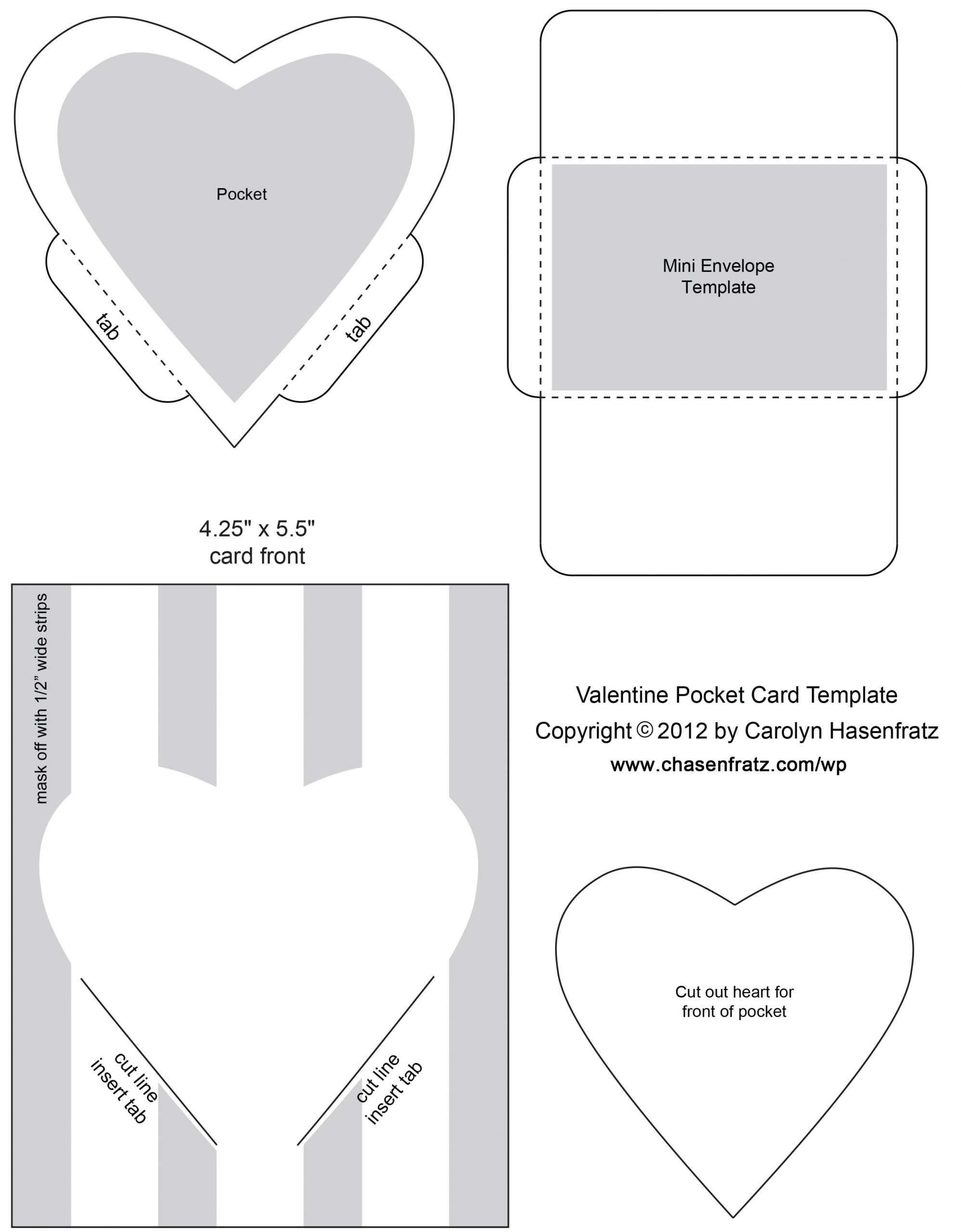
First download and print out the template Valentine Pocket Card. Cut out the Mini Envelope Template and for durability, laminate it with self-sticking laminating sheets. Use this template to find and trace around holiday themed papers and envelopes to make cute tiny envelopes. Fold the tabs at the dotted lines, and use a glue stick to glue the bottom flap to the bottom of the side flaps.
Next make a little rectangle out of scrap chipboard to use as a template for finding and tracing around greetings and sayings from old cards. The dimensions for the rectangle are 2 7/8″ x 1 7/8″. Trace with a pen or pencil around sections of cards you want to use for a mini card, then cut out.
After cutting out the greetings and sentiments, outline the edges with a metallic paint marker, and use some small festive rubber stamps to apply holiday related designs around the border. Add stamped accents to the fronts of the envelopes as well. If needed, use clean scrap paper and a bone folder to blot the inks you’re using before handling the cards so that they don’t smear.
Glue colorful festive papers to the backs of the cards with a glue stick. Burnish well, and trim.
Once they are dry enough to handle, the cards are ready to insert into the envelopes. You can seal the top flap of the envelope with the glue stick, or use a festive sticker to close the flap.
Further Reading
If you would like more ideas about how to have a more sustainable holiday season, here are other articles of mine on this topic.
Narrow strips of paper attached to a piece of scrap plexiglass.
I work on a lot of small scale stamping projects and I stamp a lot of tiny stamps, many unmounted. Sometimes I stamp things like little words for collages, mini greetings for tags and cards, or dates or days of the week for planners and journals. I like to stamp a lot of extra paper pieces for future projects when I get my stamps out – it saves a lot of time.
When I stamp a lot of tiny stamps at a time, the task is a lot easier if I tear a bunch of paper strips with a ruler then temporarily attach the ends to a piece of scrap plexiglass with rubber bands or tape. Otherwise the paper strips are kind of hard to keep in place for a clean print since they are so light and the ends tend to curl a bit.
Here are some of my tiny stamps next to the acrylic blocks I use for mounting them temporarily with double-sided tape.
I use the fronts and the sides of small acrylic stamping blocks to temporarily mount my tiny stamps with double-sided tape. I’m not that fussy about keeping the blocks clean since I usually stamp in black. But every once in awhile I’ll scrub them with stamp cleaner or Simple Green cleaner when they get too inked up to see what I’m doing. One of the reasons to use clear acrylic blocks is to see where you are stamping! If it’s not that critical to be precise you can use any small object that you can tape a stamp to and don’t mind getting inky as a temporary mount, for example I often use the lids of pill bottles or the edges of Tic-Tac containers.
Make your own decorated paper tags for a variety of craft projects!This is a good project for using up a lot of paper scraps.
Tools and Materials
Tag Art Template (scroll up and alt-click to download or get PDF – PDF Tag Art Template) Ball point pen Medium weight black marker Black rubber stamping ink Rubber stamps with sentiments Light colored, light weight paper Assorted paper scraps in a selected color scheme – I used neutrals in this demo Clean scrap paper Ruler Bone folder or squeegee Scissors Glue sticks Hole punch String, twine, or embroidery floss
Instructions:
Download my .jpeg graphic Tag Art Template above. If you prefer a PDF file here is a link – PDF Tag Art Template. Print it out onto cardstock if you can, or print it on regular paper and glue it to cardstock for stiffness and durability. Cut around the tags and punch the holes. Now you have a set of tag templates ready to use.
Here is a selection of tag templates I made for myself out of various scrap card stock and chipboard.Besides my pattern, other good sources of potential tag shapes are cookie cutters, commercial stencils, and tags from gifts you get than you can trace.There are also clear and colored plastic tags for sale where craft supplies are sold. Those could be traced and also used as the covers for tag books.
2. Trace the tag shapes onto assorted cardstock pieces. If you have scraps this is a good way to use some up. Cut out the tags close to the lines you drew, but a little outside. That will help you cut a clean edge later.
3. Pick out some light-colored paper that complements your chosen color scheme. Use a ruler as a straight edge to tear the paper into strips. Stamp greetings and sentiments onto the paper pieces with black stamping ink.
I stamped neutral pastel color strips of paper with assorted sentiments in black rubber stamping ink. Most of the stamps you see here are from my unmounted stamp set Assorted Greetings and Sentiments. You could use any sentiment stamps that you have around or tear words out of found papers or old cards.
4. Place the tags on your work surface with the outlined sides down on clean scrap paper. Glue a sentiment on the front of each tag. Fill in the rest of the tag with paper scraps. Tear them into narrow strips with the ruler if you need to.
Adding stamped sentiments and strips of decorative paper scraps to my cut out tags.
5. Trim the tags following the pen line on the back and punch out the holes.
6. Outline the tags with a black sharpie marker
What they call a Sharpie Fine Point I think of as a medium point marker because they make much finer ones. Any black marker will do if it gives you the kind of line you want around the edge. If you like, experiment on scrap cardstock or chipboard before you outline a finished tag.
7. Select two or three strands of string, twine or embroidery floss and thread through the holes with a lark’s head knot.
Once you have made the tags, what can you do with them?
Put one on the front of a greeting card.
Decorate a gift package.
Use as a bookmark.
Make a tag book.
Enhance a shadow box.
Incorporate into scrapbook or journal pages.
Make a decorative seasonal garland.
Make motivational notes for yourself.
Create decorative door hangers.
Label bottles or jars.
What else can you think of? Have fun with your tag art!
Some of my finished scribble art. This is the second of two scribbles. Are these finished “art”? Maybe they are, but even if they are not I might use the resulting textures as collage elements or image transfers in other projects in the future. They should look pretty good as is with a nice mat and frame.
The work on this page was inspired by the project “Collaborative scribble drawing” in the Expressive Arts Activity Book that I use a lot for study and inspiration (Darley and Heath 60).
Scribble art is a great icebreaker. No artistic talent or skill is needed so it’s easy to get started. If done as art therapy it can also create a rapport between the facilitator and the client by making it into a collaborative activity (Darley and Heath 60). For example, in a two person exercise each person can make a scribble on a blank piece of paper, then the participants trade papers and finish off each others drawings. The initial scribble can even be made with eyes closed to take all the pressure off of having to show artistic skill. Abstract results can also be a way to encourage conversation about something the scribble might remind the participants about (Darley and Heath 60). Following are several examples of scribble art that I made with my husband Tom and my Dad Don.
If you want to try something like these samples, here is a list for tools and materials.
Tools and Materials
Bristol board or drawing paper
Pencil
Eraser
Stencils
Black markers in various widths
Colored pencils
Found papers for collage – I used the insides of business envelopes
Tracing paper
Tape
Glue stick
Scribble art by me and Tom. I did moths on the left with Tom’s scribble and he used my scribble to add in various textures from stencils on the right.
Tom and I each made a scribble with our eyes closed with black marker on Bristol board. Next we traded papers and used commercial stencils by The Crafter’s Workshop to further develop the designs. Then we finished off our designs by coloring in parts of the image with colored pencils and markers.
Tom’s scribble was a challenge to work with because it was very dense. It did remind me of something – I turned it into moths trapped and tangled to represent trying to overcome some kind of frustration or challenge. This kind of work is not only good for the brain but just from a visual point of view it’s a good way to discover effects you might want to use in other art later on.
Scribble art by my Dad. Texture practice on the left, filling in the scribble on the right.
These examples were made by my Dad. First I gave him an introduction to Zentangle and doodle art which I wrote about in a previous blog post. He practiced making some repeating textures. Then we each made scribbles on two sheets of drawing paper. We kept our favorite of the two sheets then traded the other. Then we filled the sheets in with textures from our samplers. For extra fun we glued cutouts from the insides of business envelopes into some of the areas in the scribbles. I thought they looked cool with the hand-drawn textures. The tape and tracing paper from the materials list were used along with the pencil to get my collaged paper pieces to fit in their spots on the scribble drawing.
This is my first scribble art sheet in progress. I think it’s against the “rules” of Zentangle to pre-draw pencil lines as a guide before rendering the designs in marker. But I did it anyway!My finished scribble art after erasing the pencil lines. Bristol board and robust good quality drawing paper will stand up to a lot of erasing if you need it.I made a scribble version of Faux Postage using a printable template I shared awhile back. Dad had started this sheet awhile ago by making marks with stencils and markers in the upper left. He’d left the sheet unfinished for a year or two so I asked him if I could finish it. I was inspired by blue and black patterned envelope insides to make a monochromatic design on the sheet. When I finished marker drawing, coloring and collaging, I glued on some little pieces of paper printed with rubber stamps to evoke postage stamps. I’m going to get printouts made of this sheet and send it out to other artists when I next do some Mail Art.
I’m grateful to Dad and and Tom for doing art with me from time to time. I sure do feel a lot less lonely when I get to do a project with somebody. It helps us all with our general well-being and is also a great way to spend time together. When you’re working on art that is mostly mindless, once you get started, it’s easy to talk about various things. It’s also a good activity to do alone when you’re stressed and need to get in a better state of mind. The finished product really isn’t the point if you’re doing it for therapeutic reasons, but I also get skills and inspiration for future art work while I practice.
Works Cited andRecommended Reading
Darley, Suzanne and Wende Heath. “The Expressive Arts Activity Book: A Resource for Professionals”. Jessica Kingsley Publishers, 2008.
Coloring Idea #2: Rainbow Effect With Gel Pens and Colored Pencils
Experimenting with different ways to use stenciling as a base for coloring. Commercial stencils that I used to make the letter patterns are by The Crafter’s Workshop.
Sometimes when I do “adult coloring” I have a specific idea that I am trying to explore. At other times, I just want to color without thinking too much – it’s so soothing. Rainbow color gradations are a sure fire way to lift my mood. Here is how to get a fun effect with stencils, gel pens, and colored pencils.
Step 1: Tape a stencil over the design area and outline with a thin, sharp pencil. For this kind of utilitarian marking I really like a mechanical pencil. It’s easy to erase and I don’t have to keep stopping to sharpen it.
Step 2: With the pencil and ruler, draw parallel lines at intervals across the page.
Step 3: Note how the pencil lines you drew divide the design into striped areas. Outline your pencil lines in one gel pen color per stripe in rainbow order. For example, I outlined the first in blue, then blue green, then green, then yellow, continuing through to pink.
Step 4: To make sure the gel pen is dry, lay a clean sheet of scrap paper over your design then burnish with a squeegee or bone folder. Lift the paper and check to see if any of the ink is coming off onto the scrap paper. Repeat if necessary until no ink is transferring.
Step 5: Erase your pencil lines. You probably won’t be able to get all the pencil lines out from under the gel pen ink lines, but the rainbow effect will still come through well enough. If the pencil lines bother you, you could go back in and touch up your work later with opaque gel pen colors, paint markers, permanent markers or the like.
Step 6: Color in gradations in pencil between and around your gel pen lines, maintaining the overall color progression in hues. There is a lot of room for creativity in how to color in this step. I choose to make the pencil colored in areas lighter tints of the hues in the gel pens and keep analagous colors roughly together. Keep experimenting and coloring until you are satisfied with the effect.
The example at the above right is not finished yet. Here are a couple more examples I’m working on of the same idea so you can see the work a little closer.
In progress: art journal page on the left, beard pieces on the right.
This is a time-consuming way to color, but sometimes that is just what I want. It requires just enough concentration to distract me from problems I want to forget for awhile, but it’s not so hard to do that I need a lot of energy. Sometimes when you’re in a crisis great ambition isn’t really there. I may or may not leave some of the background white. We’ll see!
Stenciling and coloring on an art journal page. I used a hand-cut stencil of my own design plus a commercial stencil by Tim Holtz.
Bringing the coloring to Dad in the hospital
I worked on the samples you see in this article and for PART 1 both on the go and at home in order to have samples to show to my Dad. Dad likes to do the #12daysoftomsbeard project and he requested that I bring him some shapes for it to color on at the hospital. I wanted to give him a choice of coloring techniques, so I had samples of each technique ready. I had supplies on hand to cover either choice, but to streamline my supplies I only brought colored pencils as both techniques can be done with colored pencils even though I used colored markers for the first one. Dad chose the stained glass effect from PART 1 – stenciling over patches of background color.
When I brought this project to Dad, he was only a few days past some serious seizures that affected both halves of his body, but especially the left. Dad is left-handed and I was very worried because Dad’s left hand had been in a claw-like position for about a week or more. After the seizures his hand relaxed. I wasn’t sure how much function Dad would have in the hand yet, so I prepared a couple of sheets of shapes in advance for us to color, one for me to demonstrate on and one for him. I taped the shapes to scrap chipboard pieces so they wouldn’t slide around while being colored. I also brought some shapes that still needed to be cut out so that Dad could cut some if he was able.
I brought some pre-cut tags with me taped to a scrap card stock backing and also gave Dad the option to cut some out himself.
I showed Dad an overview of what we were going to do, then I offered him a chance to try cutting some shapes. He did a great job on them – with a right-handed scissors no less! I was overjoyed and a bit teary-eyed to see him doing so well. I told him this is what I want for Christmas – to see you able to do this! It seemed like a miracle compared to how he was just a few days before. For awhile I wasn’t sure if I was going to be able to ever talk with him again, much less do art together!
We used some beard shapes and holiday inspired cutouts as backgrounds for colored pencils.
I suggested some color schemes for Dad – primary colors, secondary colors, and analagous colors. It wasn’t critical that the pieces be of any particular color scheme, but when I teach a project, if I can I like to include some useful art information. I’m not a trained art therapist but I am a trained artist so I can legitimately call these activities “educational” even if I can’t officially call them “art therapy” (Darley and Heath).
I got some colored pencils out for him to cover each scheme, and let him pick from among them. Instead of covering the whole background like I did on mine, he mostly drew small shapes all over the background without covering it all the way. And instead of coloring in the negative spaces between stencil markings, he put numbers on his tags, numbers 1-11 to go along with the #12daysoftomsbeard. He was short one tag, so I’ll make a #12 later when we get to that.
In this kind of project, expressive arts for therapeutic purposes, the process is far more important than the finished results (Darley and Heath). There is no reason to try to change what Dad wanted to do if it varied from my samples. Dad has always been creative – I was so glad to see that ability is still there!
Stenciling over colored tags.Commercial stencils used to apply these patterns are by The Crafter’s Workshop.
Here I am drawing stencil lines over the colored in shapes before filling in the negative spaces with black permanent marker. The main difference between coloring over marker vs. colored pencil is that the colored pencil creates a slightly waxy surface which might resist the marker at first. To help with this, I outlined the black areas in gel pen before filling in with a black Sharpie marker. The gel pen sticks better to the colored pencil and once the outlining is done then it’s not hard to fill in with the Sharpie.
Embellishing colored pieces with punched paper shapes and sequins.
I have started embellishing some of the pieces that we colored with punched paper pieces, glued-on sequins and little dots of squeeze paint to go along with the stenciling.
Caption
When #12daysoftomsbeard starts on December 25, we’ll have a good selection of items to display on the beard. Hopefully people will send us more parts as a challenge to incorporate each day. The first year we did this activity, in 2019, I started out by clipping little pieces of paper to Tom’s beard with tiny clothespins. To keep things interesting, we’ve been gradually elaborating by making little garlands, involving Tom’s glasses, adding found objects and props, incorporating parts of the background, using far-out creative filters and more.
What will happen?
Some of my favorite #12daysoftomsbeard pictures from 2019-2022
Above is a commemorative artistamp sheet I made to show off some of my favorite beard pictures from the first three years we did this project.
Works Cited andRecommended Reading
Darley, Suzanne and Wende Heath. “The Expressive Arts Activity Book: A Resource for Professionals”. Jessica Kingsley Publishers, 2008.


